


Bayesian moderation analysis#
This notebook covers Bayesian moderation analysis. This is appropriate when we believe that one predictor variable (the moderator) may influence the linear relationship between another predictor variable and an outcome. Here we look at an example where we look at the relationship between hours of training and muscle mass, where it may be that age (the moderating variable) affects this relationship.
This is not intended as a one-stop solution to a wide variety of data analysis problems, rather, it is intended as an educational exposition to show how moderation analysis works and how to conduct Bayesian parameter estimation in PyMC.
Note that this is sometimes mixed up with mediation analysis. Mediation analysis is appropriate when we believe the effect of a predictor variable upon an outcome variable is (partially, or fully) mediated through a 3rd mediating variable. Readers are referred to the textbook by Hayes [2017] as a comprehensive (albeit Frequentist) guide to moderation and related models as well as the PyMC example Bayesian mediation analysis.
import arviz as az
import matplotlib.pyplot as plt
import numpy as np
import pandas as pd
import pymc as pm
import xarray as xr

from matplotlib.cm import ScalarMappable
from matplotlib.colors import Normalize
az.style.use("arviz-darkgrid")
%config InlineBackend.figure_format = 'retina'
First in the (hidden) code cell below, we define some helper functions for plotting that we will use later.
Does the effect of training upon muscularity decrease with age?#
I’ve taken inspiration from a blog post van den Berg [n.d.] which examines whether age influences (moderates) the effect of training on muscle percentage. We might speculate that more training results in higher muscle mass, at least for younger people. But it might be the case that the relationship between training and muscle mass changes with age - perhaps training is less effective at increasing muscle mass in older age?
The schematic box and arrow notation often used to represent moderation is shown by an arrow from the moderating variable to the line between a predictor and an outcome variable.
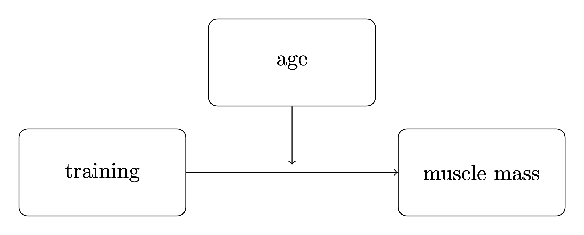
It can be useful to use consistent notation, so we will define:
\(x\) as the main predictor variable. In this example it is training.
\(y\) as the outcome variable. In this example it is muscle percentage.
\(m\) as the moderator. In this example it is age.
The moderation model#
While the visual schematic (above) is a useful shorthand to understand complex models when you already know what moderation is, you can’t derive it from the diagram alone. So let us formally specify the moderation model - it defines an outcome variable \(y\) as:
where \(y\), \(x\), and \(m\) are your observed data, and the following are the model parameters:
\(\beta_0\) is the intercept, its value does not have that much importance in the interpretation of this model.
\(\beta_1\) is the rate at which \(y\) (muscle percentage) increases per unit of \(x\) (training hours).
\(\beta_2\) is the coefficient for the interaction term \(x \cdot m\).
\(\beta_3\) is the rate at which \(y\) (muscle percentage) increases per unit of \(m\) (age).
\(\sigma\) is the standard deviation of the observation noise.
We can see that the mean \(y\) is simply a multiple linear regression with an interaction term between the two predictors, \(x\) and \(m\).
We can get some insight into why this is the case by thinking about this as a multiple linear regression with \(x\) and \(m\) as predictor variables, but where the value of \(m\) influences the relationship between \(x\) and \(y\). This is achieved by making the regression coefficient for \(x\) is a function of \(m\):
and if we define that as a linear function, \(f(m) = \beta_1 + \beta_2 \cdot m\), we get
We can use \(f(m) = \beta_1 + \beta_2 \cdot m\) later to visualise the moderation effect.
Import data#
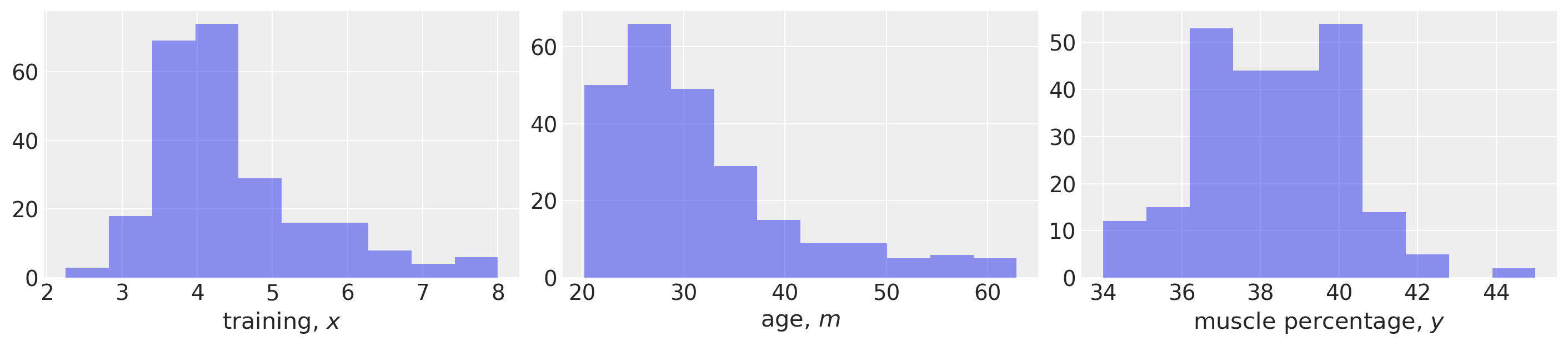
First, we will load up our example data and do some basic data visualisation. The dataset is taken from van den Berg [n.d.] but it is unclear if this corresponds to real life research data or if it was simulated.
def load_data():
    try:
        df = pd.read_csv("../data/muscle-percent-males-interaction.csv")
    except:
        df = pd.read_csv(pm.get_data("muscle-percent-males-interaction.csv"))

    x = df["thours"].values
    m = df["age"].values
    y = df["mperc"].values
    return (x, y, m)


x, y, m = load_data()

# Make a scalar color map for this dataset (Just for plotting, nothing to do with inference)
scalarMap = make_scalarMap(m)
fig, ax = plt.subplots(1, 3, figsize=(14, 3))

ax[0].hist(x, alpha=0.5)
ax[0].set(xlabel="training, $x$")

ax[1].hist(m, alpha=0.5)
ax[1].set(xlabel="age, $m$")

ax[2].hist(y, alpha=0.5)
ax[2].set(xlabel="muscle percentage, $y$");
Define the PyMC model and conduct inference#
def model_factory(x, m, y):
    with pm.Model() as model:
        x = pm.ConstantData("x", x)
        m = pm.ConstantData("m", m)
        # priors
        β0 = pm.Normal("β0", mu=0, sigma=10)
        β1 = pm.Normal("β1", mu=0, sigma=10)
        β2 = pm.Normal("β2", mu=0, sigma=10)
        β3 = pm.Normal("β3", mu=0, sigma=10)
        σ = pm.HalfCauchy("σ", 1)
        # likelihood
        y = pm.Normal("y", mu=β0 + (β1 * x) + (β2 * x * m) + (β3 * m), sigma=σ, observed=y)

    return model
model = model_factory(x, m, y)
Plot the model graph to confirm it is as intended.
pm.model_to_graphviz(model)

with model:
    result = pm.sample(draws=1000, tune=1000, random_seed=42, nuts={"target_accept": 0.9})
Sampling 4 chains for 1_000 tune and 1_000 draw iterations (4_000 + 4_000 draws total) took 9 seconds.
Visualise the trace to check for convergence.
az.plot_trace(result);
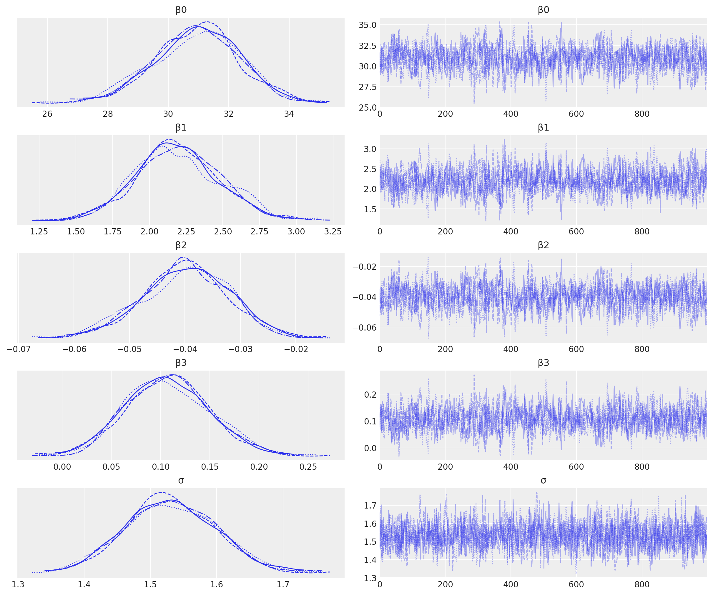
We have good chain mixing and the posteriors for each chain look very similar, so no problems in that regard.
Visualise the important parameters#
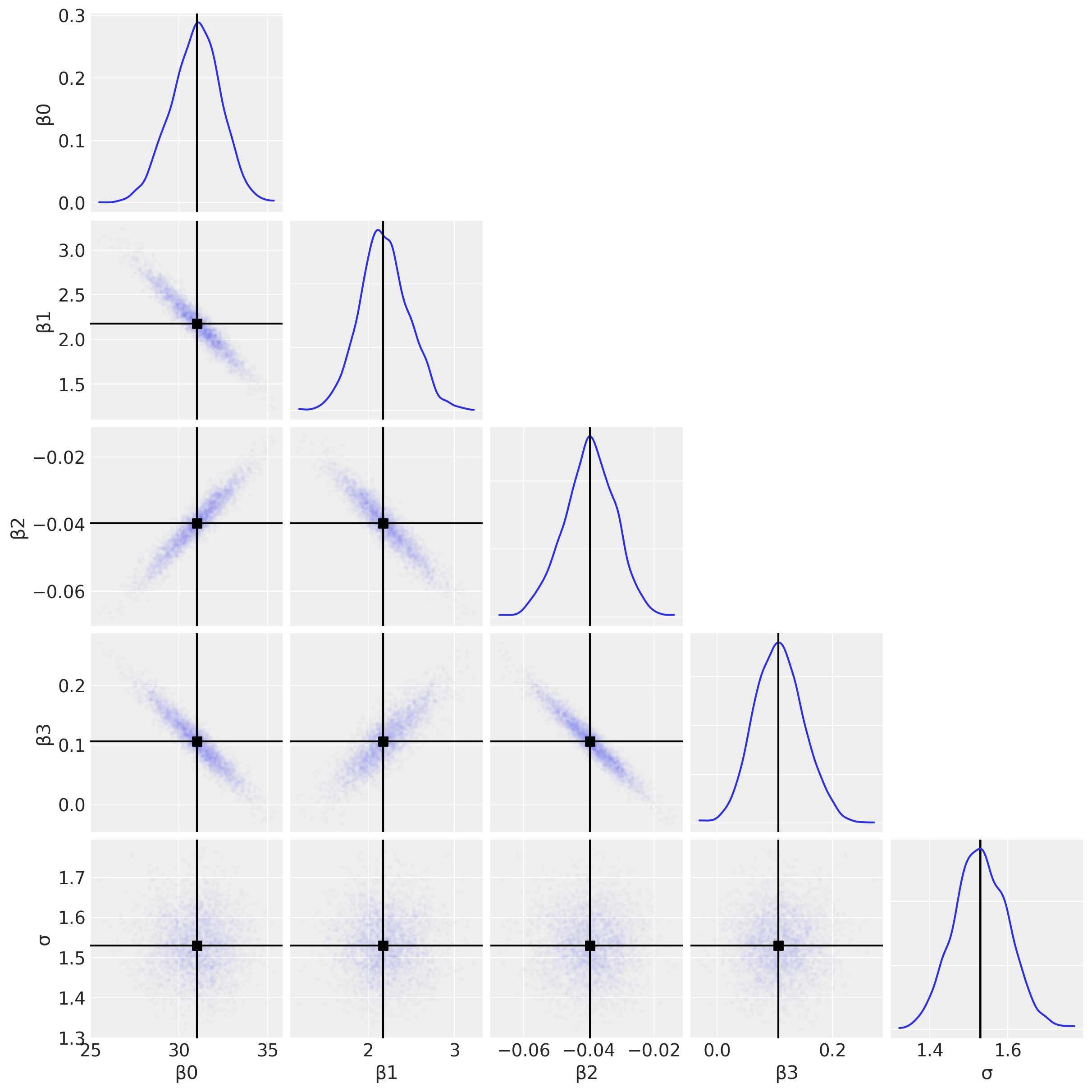
First we will use a pair plot to look at joint posterior distributions. This might help us identify any estimation issues with the interaction term (see the discussion below about multicollinearity).
az.plot_pair(
    result,
    marginals=True,
    point_estimate="median",
    figsize=(12, 12),
    scatter_kwargs={"alpha": 0.01},
);
And just for the sake of completeness, we can plot the posterior distributions for each of the \(\beta\) parameters and use this to arrive at research conclusions.
az.plot_posterior(result, var_names=["β1", "β2", "β3"], figsize=(14, 4));
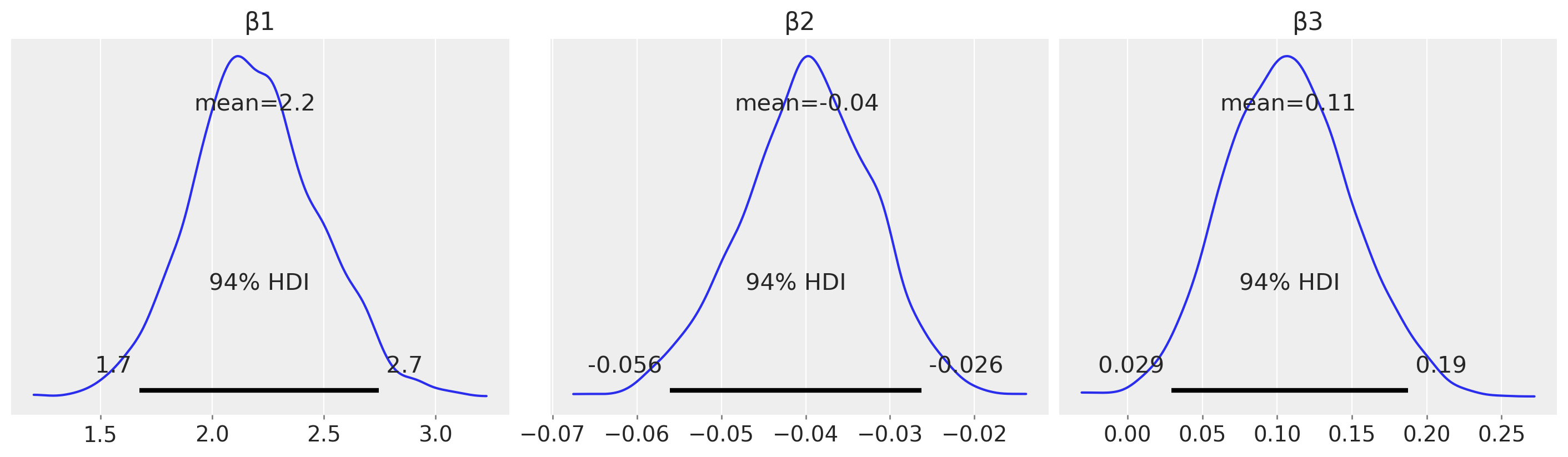
For example, from an estimation (in contrast to a hypothesis testing) perspective, we could look at the posterior over \(\beta_2\) and claim a credibly less than zero moderation effect.
Posterior predictive checks#
Define a set of quantiles of \(m\) that we are interested in visualising.
m_quantiles = [0.025, 0.25, 0.5, 0.75, 0.975]
Visualisation in data space#
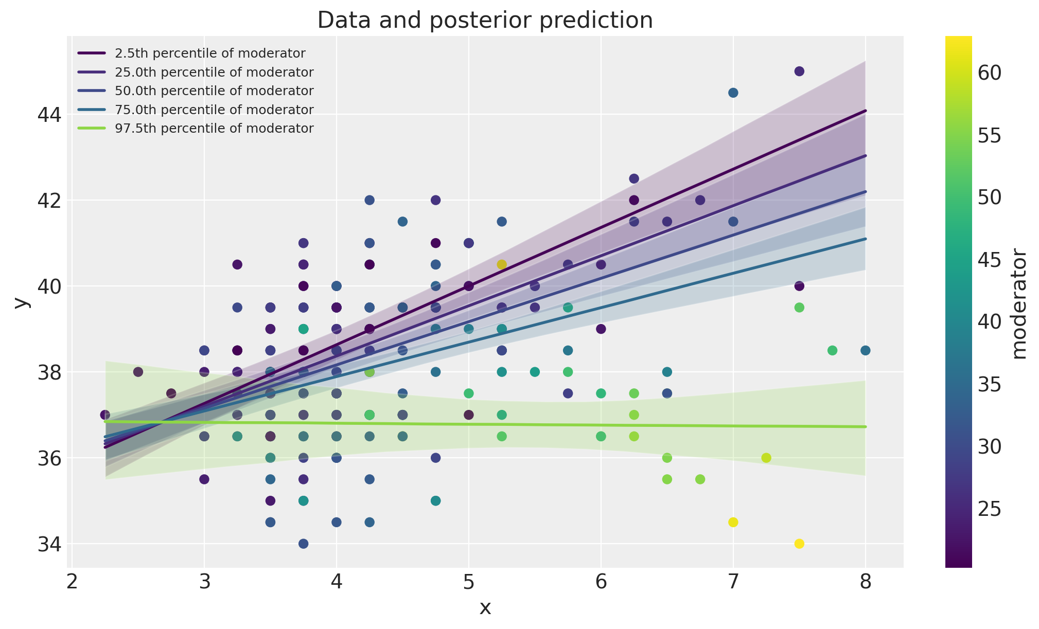
Here we will plot the data alongside model posterior predictive checks. This can be a useful visual method of comparing the model predictions against the data.
fig, ax = plt.subplots(figsize=(10, 6))
ax = plot_data(x, m, y, ax=ax)
posterior_prediction_plot(result, x, m, m_quantiles, ax=ax)
ax.set_title("Data and posterior prediction");
Spotlight graph#
We can also visualise the moderation effect by plotting \(\beta_1 + \beta_2 \cdot m\) as a function of the \(m\). This was named a spotlight graph, see Spiller et al. [2013] and McClelland et al. [2017].
fig, ax = plt.subplots(1, 2, figsize=(10, 5))
plot_moderation_effect(result, m, m_quantiles, ax[0])
az.plot_posterior(result, var_names="β2", ax=ax[1]);
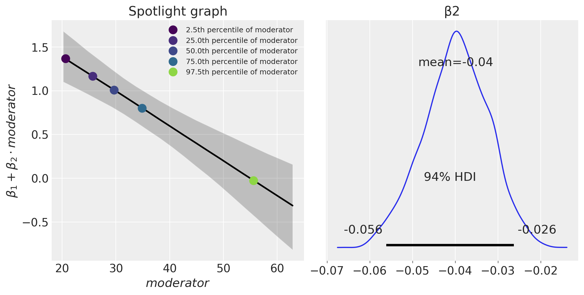
The expression \(\beta_1 + \beta_2 \cdot \text{moderator}\) defines the rate of change of the outcome (muscle percentage) per unit of \(x\) (training hours/week). We can see that as age (the moderator) increases, this effect of training hours/week on muscle percentage decreases.
Further reading#
Further information about the ‘moderation effect’, or what McClelland et al. [2017] called a spotlight graphs, can be found in Bauer and Curran [2005] and Spiller et al. [2013]. Although these papers take a frequentist (not Bayesian) perspective.
Zhang and Wang [2017] compare maximum likelihood and Bayesian methods for moderation analysis with missing predictor variables.
Multicollinearity, data centering, and linear models with interaction terms are also discussed in a number of prominent Bayesian text books [Kruschke, 2014, McElreath, 2018, Gelman et al., 2013, Gelman et al., 2020].
References#
John Kruschke. Doing Bayesian data analysis: A tutorial with R, JAGS, and Stan. Academic Press, 2014.
Richard McElreath. Statistical rethinking: A Bayesian course with examples in R and Stan. Chapman and Hall/CRC, 2018.
Andrew F Hayes. Introduction to mediation, moderation, and conditional process analysis: A regression-based approach. Guilford publications, 2017.
R. G van den Berg. Spss moderation regression tutorial. URL: https://www.spss-tutorials.com/spss-regression-with-moderation-interaction-effect/ (visited on 2022-03-20).
Stephen A Spiller, Gavan J Fitzsimons, John G Lynch Jr, and Gary H McClelland. Spotlights, floodlights, and the magic number zero: simple effects tests in moderated regression. Journal of marketing research, 50(2):277–288, 2013.
Gary H McClelland, Julie R Irwin, David Disatnik, and Liron Sivan. Multicollinearity is a red herring in the search for moderator variables: a guide to interpreting moderated multiple regression models and a critique of iacobucci, schneider, popovich, and bakamitsos (2016). Behavior research methods, 49(1):394–402, 2017.
Dawn Iacobucci, Matthew J Schneider, Deidre L Popovich, and Georgios A Bakamitsos. Mean centering helps alleviate “micro” but not “macro” multicollinearity. Behavior research methods, 48(4):1308–1317, 2016.
Dawn Iacobucci, Matthew J Schneider, Deidre L Popovich, and Georgios A Bakamitsos. Mean centering, multicollinearity, and moderators in multiple regression: the reconciliation redux. Behavior research methods, 49(1):403–404, 2017.
Daniel J Bauer and Patrick J Curran. Probing interactions in fixed and multilevel regression: inferential and graphical techniques. Multivariate behavioral research, 40(3):373–400, 2005.
Qian Zhang and Lijuan Wang. Moderation analysis with missing data in the predictors. Psychological methods, 22(4):649, 2017.
Andrew Gelman, John B. Carlin, Hal S. Stern, David B. Dunson, Aki Vehtari, and Donald B. Rubin. Bayesian Data Analysis. Chapman and Hall/CRC, 2013.
Andrew Gelman, Jennifer Hill, and Aki Vehtari. Regression and other stories. Cambridge University Press, 2020.
Watermark#
%load_ext watermark
%watermark -n -u -v -iv -w -p pytensor,aeppl,xarray
Last updated: Sun Feb 05 2023

Python implementation: CPython
Python version       : 3.10.9
IPython version      : 8.9.0

pytensor: 2.8.11
aeppl   : not installed
xarray  : 2023.1.0

pandas    : 1.5.3
arviz     : 0.14.0
xarray    : 2023.1.0
numpy     : 1.24.1
pymc      : 5.0.1
matplotlib: 3.6.3

Watermark: 2.3.1
License notice#
All the notebooks in this example gallery are provided under the MIT License which allows modification, and redistribution for any use provided the copyright and license notices are preserved.
Citing PyMC examples#
To cite this notebook, use the DOI provided by Zenodo for the pymc-examples repository.
Important
Many notebooks are adapted from other sources: blogs, books… In such cases you should cite the original source as well.
Also remember to cite the relevant libraries used by your code.
Here is an citation template in bibtex:
@incollection{citekey,
  author    = "<notebook authors, see above>",
  title     = "<notebook title>",
  editor    = "PyMC Team",
  booktitle = "PyMC examples",
  doi       = "10.5281/zenodo.5654871"
}
which once rendered could look like: