


Gaussian Process for CO2 at Mauna Loa#
This Gaussian Process (GP) example shows how to:
Design combinations of covariance functions
Use additive GPs whose individual components can be used for prediction
Perform maximum a-posteriori (MAP) estimation
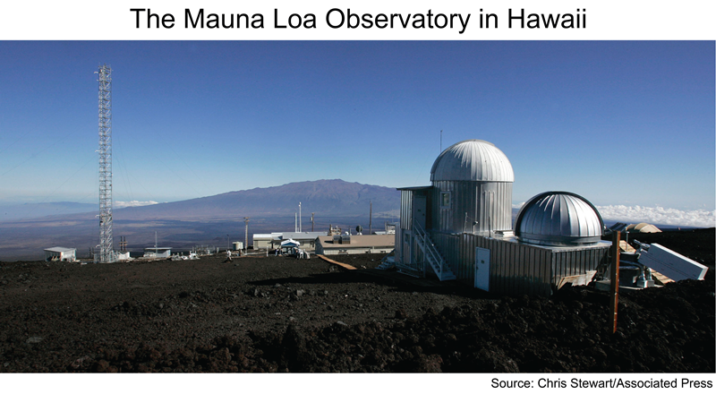
Since the late 1950’s, the Mauna Loa observatory has been taking regular measurements of atmospheric CO\(_2\). In the late 1950’s Charles Keeling invented a accurate way to measure atmospheric CO\(_2\) concentration. Since then, CO\(_2\) measurements have been recorded nearly continuously at the Mauna Loa observatory. Check out last hours measurement result here.
Not much was known about how fossil fuel burning influences the climate in the late 1950s. The first couple years of data collection showed that CO\(_2\) levels rose and fell following summer and winter, tracking the growth and decay of vegetation in the northern hemisphere. As multiple years passed, the steady upward trend increasingly grew into focus. With over 70 years of collected data, the Keeling curve is one of the most important climate indicators.
The history behind these measurements and their influence on climatology today and other interesting reading:
Let’s load in the data, tidy it up, and have a look. The raw data set is located here. This notebook uses the Bokeh package for plots that benefit from interactivity.
Preparing the data#
Attention
This notebook uses libraries that are not PyMC dependencies and therefore need to be installed specifically to run this notebook. Open the dropdown below for extra guidance.
Extra dependencies install instructions
In order to run this notebook (either locally or on binder) you won’t only need a working PyMC installation with all optional dependencies, but also to install some extra dependencies. For advise on installing PyMC itself, please refer to Installation
You can install these dependencies with your preferred package manager, we provide as an example the pip and conda commands below.
$ pip install bokeh
Note that if you want (or need) to install the packages from inside the notebook instead of the command line, you can install the packages by running a variation of the pip command:
import sys
!{sys.executable} -m pip install bokeh
You should not run !pip install as it might install the package in a different
environment and not be available from the Jupyter notebook even if installed.
Another alternative is using conda instead:
$ conda install bokeh
when installing scientific python packages with conda, we recommend using conda forge
import numpy as np
import pandas as pd
import pymc as pm

from bokeh.io import output_notebook
from bokeh.models import BoxAnnotation, Label, Legend, Span
from bokeh.palettes import brewer
from bokeh.plotting import figure, show

output_notebook()

import warnings

warnings.simplefilter(action="ignore", category=FutureWarning)
%config InlineBackend.figure_format = 'retina'
RANDOM_SEED = 8927
rng = np.random.default_rng(RANDOM_SEED)
# get data
try:
    data_monthly = pd.read_csv("../data/monthly_in_situ_co2_mlo.csv", header=56)
except FileNotFoundError:
    data_monthly = pd.read_csv(pm.get_data("monthly_in_situ_co2_mlo.csv"), header=56)

# replace -99.99 with NaN
data_monthly.replace(to_replace=-99.99, value=np.nan, inplace=True)

# fix column names
cols = [
    "year",
    "month",
    "--",
    "--",
    "CO2",
    "seasonaly_adjusted",
    "fit",
    "seasonally_adjusted_fit",
    "CO2_filled",
    "seasonally_adjusted_filled",
]
data_monthly.columns = cols
cols.remove("--")
cols.remove("--")
data_monthly = data_monthly[cols]

# drop rows with nan
data_monthly.dropna(inplace=True)

# fix time index
data_monthly["day"] = 15
data_monthly.index = pd.to_datetime(data_monthly[["year", "month", "day"]])
cols.remove("year")
cols.remove("month")
data_monthly = data_monthly[cols]

data_monthly.head(5)
| CO2 | seasonaly_adjusted | fit | seasonally_adjusted_fit | CO2_filled | seasonally_adjusted_filled | |
|---|---|---|---|---|---|---|
| 1958-03-15 | 315.71 | 314.44 | 316.19 | 314.91 | 315.71 | 314.44 |
| 1958-04-15 | 317.45 | 315.16 | 317.30 | 314.99 | 317.45 | 315.16 |
| 1958-05-15 | 317.51 | 314.70 | 317.87 | 315.07 | 317.51 | 314.70 |
| 1958-07-15 | 315.86 | 315.20 | 315.86 | 315.22 | 315.86 | 315.20 |
| 1958-08-15 | 314.93 | 316.20 | 313.98 | 315.29 | 314.93 | 316.20 |
# function to convert datetimes to indexed numbers that are useful for later prediction
def dates_to_idx(timelist):
    reference_time = pd.to_datetime("1958-03-15")
    t = (timelist - reference_time) / pd.Timedelta(365, "D")
    return np.asarray(t)


t = dates_to_idx(data_monthly.index)

# normalize CO2 levels
y = data_monthly["CO2"].values
first_co2 = y[0]
std_co2 = np.std(y)
y_n = (y - first_co2) / std_co2

data_monthly = data_monthly.assign(t=t)
data_monthly = data_monthly.assign(y_n=y_n)
This data might be familiar to you, since it was used as an example in the Gaussian Processes for Machine Learning book by . The version of the data set they use starts in the late 1950’s, but stops at the end of 2003. So that our PyMC example is somewhat comparable to their example, we use the stretch of data from before 2004 as the “training” set. The data from 2004 to 2022 we’ll use to test our predictions.
# split into training and test set
sep_idx = data_monthly.index.searchsorted(pd.to_datetime("2003-12-15"))
data_early = data_monthly.iloc[: sep_idx + 1, :]
data_later = data_monthly.iloc[sep_idx:, :]
# plot training and test data
p = figure(
    x_axis_type="datetime",
    title="Monthly CO2 Readings from Mauna Loa",
    width=550,
    height=350,
)
p.yaxis.axis_label = "CO2 [ppm]"
p.xaxis.axis_label = "Date"
predict_region = BoxAnnotation(
    left=pd.to_datetime("2003-12-15"), fill_alpha=0.1, fill_color="firebrick"
)
p.add_layout(predict_region)
ppm400 = Span(location=400, dimension="width", line_color="red", line_dash="dashed", line_width=2)
p.add_layout(ppm400)

p.line(data_monthly.index, data_monthly["CO2"], line_width=2, line_color="black", alpha=0.5)
# p.circle(data_monthly.index, data_monthly["CO2"], line_color="black", alpha=0.1, size=2)
p.scatter(
    data_monthly.index, data_monthly["CO2"], marker="circle", line_color="black", alpha=0.1, size=2
)


train_label = Label(
    x=100,
    y=165,
    x_units="screen",
    y_units="screen",
    text="Training Set",
    border_line_alpha=0.0,
    background_fill_alpha=0.0,
)
test_label = Label(
    x=585,
    y=80,
    x_units="screen",
    y_units="screen",
    text="Test Set",
    border_line_alpha=0.0,
    background_fill_alpha=0.0,
)

p.add_layout(train_label)
p.add_layout(test_label)
show(p)
Bokeh plots are interactive, so panning and zooming can be done with the sidebar on the right hand side. The seasonal rise and fall is plainly apparent, as is the upward trend. Here is a link to an plots of this curve at different time scales, and in the context of historical ice core data.
The 400 ppm level is highlighted with a dashed line. In addition to fitting a descriptive model, our goal will be to predict the first month the 400 ppm threshold is crossed, which was May, 2013. In the data set above, the CO\(_2\) average reading for May, 2013 was about 399.98, close enough to be our correct target date.
Modeling the Keeling Curve using GPs#
As a starting point, we use the GP model described in . Instead of using flat priors on covariance function hyperparameters and then maximizing the marginal likelihood like is done in the textbook, we place somewhat informative priors on the hyperparameters and use optimization to find the MAP point. We use the gp.Marginal since Gaussian noise is assumed.
The R&W [] model is a sum of three GPs for the signal, and one GP for the noise.
A long term smooth rising trend represented by an exponentiated quadratic kernel.
A periodic term that decays away from exact periodicity. This is represented by the product of a
Periodicand aMatern52covariance functions.Small and medium term irregularities with a rational quadratic kernel.
The noise is modeled as the sum of a
Matern32and a white noise kernel.
The prior on CO\(_2\) as a function of time is,
Hyperparameter priors#
We use fairly uninformative priors for the scale hyperparameters of the covariance functions, and informative Gamma parameters for lengthscales. The PDFs used for the lengthscale priors is shown below:
x = np.linspace(0, 150, 5000)
priors = [
    ("ℓ_pdecay", pm.Gamma.dist(alpha=10, beta=0.075)),
    ("ℓ_psmooth", pm.Gamma.dist(alpha=4, beta=3)),
    ("period", pm.Normal.dist(mu=1.0, sigma=0.05)),
    ("ℓ_med", pm.Gamma.dist(alpha=2, beta=0.75)),
    ("α", pm.Gamma.dist(alpha=5, beta=2)),
    ("ℓ_trend", pm.Gamma.dist(alpha=4, beta=0.1)),
    ("ℓ_noise", pm.Gamma.dist(alpha=2, beta=4)),
]

colors = brewer["Paired"][7]

p = figure(
    title="Lengthscale and period priors",
    width=550,
    height=350,
    x_range=(-1, 8),
    y_range=(0, 2),
)
p.yaxis.axis_label = "Probability"
p.xaxis.axis_label = "Years"

for i, prior in enumerate(priors):
    p.line(
        x,
        np.exp(pm.logp(prior[1], x).eval()),
        legend_label=prior[0],
        line_width=3,
        line_color=colors[i],
    )
show(p)
ℓ_pdecay: The periodic decay. The smaller this parameter is, the faster the periodicity goes away. I doubt that the seasonality of the CO\(_2\) will be going away any time soon (hopefully), and there’s no evidence for that in the data. Most of the prior mass is from 60 to >140 years.ℓ_psmooth: The smoothness of the periodic component. It controls how “sinusoidal” the periodicity is. The plot of the data shows that seasonality is not an exact sine wave, but its not terribly different from one. We use a Gamma whose mode is at one, and doesn’t have too large of a variance, with most of the prior mass from around 0.5 and 2.period: The period. We put a very strong prior on \(p\), the period that is centered at one. R&W fix \(p=1\), since the period is annual.ℓ_med: This is the lengthscale for the short to medium long variations. This prior has most of its mass below 6 years.α: This is the shape parameter. This prior is centered at 3, since we’re expecting there to be some more variation than could be explained by an exponentiated quadratic.ℓ_trend: The lengthscale of the long term trend. It has a wide prior with mass on a decade scale. Most of the mass is between 10 to 60 years.ℓ_noise: The lengthscale of the noise covariance. This noise should be very rapid, in the scale of several months to at most a year or two.
We know beforehand which GP components should have a larger magnitude, so we include this information in the scale parameters.
x = np.linspace(0, 4, 5000)
priors = [
    ("η_per", pm.HalfCauchy.dist(beta=2)),
    ("η_med", pm.HalfCauchy.dist(beta=1.0)),
    (
        "η_trend",
        pm.HalfCauchy.dist(beta=3),
    ),  # will use beta=2, but beta=3 is visible on plot
    ("σ", pm.HalfNormal.dist(sigma=0.25)),
    ("η_noise", pm.HalfNormal.dist(sigma=0.5)),
]

colors = brewer["Paired"][5]

p = figure(title="Scale priors", width=550, height=350)
p.yaxis.axis_label = "Probability"
p.xaxis.axis_label = "Years"

for i, prior in enumerate(priors):
    p.line(
        x,
        np.exp(pm.logp(prior[1], x).eval()),
        legend_label=prior[0],
        line_width=3,
        line_color=colors[i],
    )
show(p)
For all of the scale priors we use distributions that shrink the scale towards zero. The seasonal component and the long term trend have the least mass near zero, since they are the largest influences in the data.
η_per: Scale of the periodic or seasonal component.η_med: Scale of the short to medium term component.η_trend: Scale of the long term trend.σ: Scale of the white noise.η_noise: Scale of correlated, short term noise.
The model in PyMC#
Below is the actual model. Each of the three component GPs is constructed separately. Since we are doing MAP, we use Marginal GPs and lastly call the .marginal_likelihood method to specify the marginal posterior.
# pull out normalized data
t = data_early["t"].values[:, None]
y = data_early["y_n"].values
with pm.Model() as model:
    # yearly periodic component x long term trend
    η_per = pm.HalfCauchy("η_per", beta=2, initval=1.0)
    ℓ_pdecay = pm.Gamma("ℓ_pdecay", alpha=10, beta=0.075)
    period = pm.Normal("period", mu=1, sigma=0.05)
    ℓ_psmooth = pm.Gamma("ℓ_psmooth ", alpha=4, beta=3)
    cov_seasonal = (
        η_per**2 * pm.gp.cov.Periodic(1, period, ℓ_psmooth) * pm.gp.cov.Matern52(1, ℓ_pdecay)
    )
    gp_seasonal = pm.gp.Marginal(cov_func=cov_seasonal)

    # small/medium term irregularities
    η_med = pm.HalfCauchy("η_med", beta=0.5, initval=0.1)
    ℓ_med = pm.Gamma("ℓ_med", alpha=2, beta=0.75)
    α = pm.Gamma("α", alpha=5, beta=2)
    cov_medium = η_med**2 * pm.gp.cov.RatQuad(1, ℓ_med, α)
    gp_medium = pm.gp.Marginal(cov_func=cov_medium)

    # long term trend
    η_trend = pm.HalfCauchy("η_trend", beta=2, initval=2.0)
    ℓ_trend = pm.Gamma("ℓ_trend", alpha=4, beta=0.1)
    cov_trend = η_trend**2 * pm.gp.cov.ExpQuad(1, ℓ_trend)
    gp_trend = pm.gp.Marginal(cov_func=cov_trend)

    # noise model
    η_noise = pm.HalfNormal("η_noise", sigma=0.5, initval=0.05)
    ℓ_noise = pm.Gamma("ℓ_noise", alpha=2, beta=4)
    σ = pm.HalfNormal("σ", sigma=0.25, initval=0.05)
    cov_noise = η_noise**2 * pm.gp.cov.Matern32(1, ℓ_noise) + pm.gp.cov.WhiteNoise(σ)

    # The Gaussian process is a sum of these three components
    gp = gp_seasonal + gp_medium + gp_trend

    # Since the normal noise model and the GP are conjugates, we use `Marginal` with the `.marginal_likelihood` method
    y_ = gp.marginal_likelihood("y", X=t, y=y, noise=cov_noise)

    # this line calls an optimizer to find the MAP
    mp = pm.find_MAP(include_transformed=True)
# display the results, dont show transformed parameter values
sorted([name + ":" + str(mp[name]) for name in mp.keys() if not name.endswith("_")])
['period:1.0003843435401372',
 'α:1.1889196210182555',
 'η_med:0.02133859918355303',
 'η_noise:0.0068893824144748',
 'η_per:0.08855403712028953',
 'η_trend:1.6742539893468817',
 'σ:0.005901415659939548',
 'ℓ_med:1.5255664888922797',
 'ℓ_noise:0.16509371155321878',
 'ℓ_pdecay:125.69432392890639',
 'ℓ_psmooth :0.7274875472167703',
 'ℓ_trend:54.75272640005412']
At first glance the results look reasonable. The lengthscale that determines how fast the seasonality varies is about 126 years. This means that given the data, we wouldn’t expect such strong periodicity to vanish until centuries have passed. The trend lengthscale is also long, about 50 years.
Examining the fit of each of the additive GP components#
The code below looks at the fit of the total GP, and each component individually. The total fit and its \(2\sigma\) uncertainty are shown in red.
# predict at a 15 day granularity
dates = pd.date_range(start="3/15/1958", end="12/15/2003", freq="15D")
tnew = dates_to_idx(dates)[:, None]

print("Predicting with gp ...")
with model:
    mu, var = gp.predict(tnew, point=mp, diag=True)
mean_pred = mu * std_co2 + first_co2
var_pred = var * std_co2**2

# make dataframe to store fit results
fit = pd.DataFrame(
    {"t": tnew.flatten(), "mu_total": mean_pred, "sd_total": np.sqrt(var_pred)},
    index=dates,
)

print("Predicting with gp_trend ...")
with model:
    mu, var = gp_trend.predict(
        tnew, point=mp, given={"gp": gp, "X": t, "y": y, "noise": cov_noise}, diag=True
    )
fit = fit.assign(mu_trend=mu * std_co2 + first_co2, sd_trend=np.sqrt(var * std_co2**2))

print("Predicting with gp_medium ...")
with model:
    mu, var = gp_medium.predict(
        tnew, point=mp, given={"gp": gp, "X": t, "y": y, "noise": cov_noise}, diag=True
    )
fit = fit.assign(mu_medium=mu * std_co2 + first_co2, sd_medium=np.sqrt(var * std_co2**2))

print("Predicting with gp_seasonal ...")
with model:
    # predict at a 15 day granularity
    mu, var = gp_seasonal.predict(
        tnew, point=mp, given={"gp": gp, "X": t, "y": y, "noise": cov_noise}, diag=True
    )
fit = fit.assign(mu_seasonal=mu * std_co2 + first_co2, sd_seasonal=np.sqrt(var * std_co2**2))
print("Done")
Predicting with gp ...
Predicting with gp_trend ...
Predicting with gp_medium ...
Predicting with gp_seasonal ...
Done
## plot the components
p = figure(
    title="Decomposition of the Mauna Loa Data",
    x_axis_type="datetime",
    width=550,
    height=350,
)
p.yaxis.axis_label = "CO2 [ppm]"
p.xaxis.axis_label = "Date"

# plot mean and 2σ region of total prediction
upper = fit.mu_total + 2 * fit.sd_total
lower = fit.mu_total - 2 * fit.sd_total
band_x = np.append(fit.index.values, fit.index.values[::-1])
band_y = np.append(lower, upper[::-1])

# total fit
p.line(
    fit.index,
    fit.mu_total,
    line_width=1,
    line_color="firebrick",
    legend_label="Total fit",
)
p.patch(band_x, band_y, color="firebrick", alpha=0.6, line_color="white")

# trend
p.line(
    fit.index,
    fit.mu_trend,
    line_width=1,
    line_color="blue",
    legend_label="Long term trend",
)

# medium
p.line(
    fit.index,
    fit.mu_medium,
    line_width=1,
    line_color="green",
    legend_label="Medium range variation",
)

# seasonal
p.line(
    fit.index,
    fit.mu_seasonal,
    line_width=1,
    line_color="orange",
    legend_label="Seasonal process",
)

# true value
p.scatter(
    data_monthly.index,
    data_monthly["CO2"],
    marker="circle",
    line_color="black",
    alpha=0.1,
    size=5,
    legend_label="Observed data",
)

p.legend.location = "top_left"
show(p)
The fit matches the observed data very well. The trend, seasonality, and short/medium term effects also are cleanly separated out. If you zoom so the seasonal process fills the plot window (from x equals 1955 to 2004, from y equals 310 to 320), it appears to be widening as time goes on. Lets plot the first year of each decade:
# plot several years

p = figure(title="Several years of the seasonal component", width=550, height=350)
p.yaxis.axis_label = "Δ CO2 [ppm]"
p.xaxis.axis_label = "Month"

colors = brewer["Paired"][5]
years = ["1960", "1970", "1980", "1990", "2000"]

for i, year in enumerate(years):
    dates = pd.date_range(start="1/1/" + year, end="12/31/" + year, freq="10D")
    tnew = dates_to_idx(dates)[:, None]

    print("Predicting year", year)
    with model:
        mu, var = gp_seasonal.predict(
            tnew, point=mp, diag=True, given={"gp": gp, "X": t, "y": y, "noise": cov_noise}
        )
    mu_pred = mu * std_co2

    # plot mean
    x = np.asarray((dates - dates[0]) / pd.Timedelta(30, "D")) + 1
    p.line(x, mu_pred, line_width=1, line_color=colors[i], legend_label=year)

p.legend.location = "bottom_left"
show(p)
Predicting year 1960
Predicting year 1970
Predicting year 1980
Predicting year 1990
Predicting year 2000
This plot makes it clear that there is a broadening over time. So it would seem that as there is more CO\(_2\) in the atmosphere, the absorption/release cycle due to the growth and decay of vegetation in the northern hemisphere becomes more slightly more pronounced.
What day will the CO2 level break 400 ppm?#
How well do our forecasts look? Clearly the observed data trends up and the seasonal effect is very pronounced. Does our GP model capture this well enough to make reasonable extrapolations? Our “training” set went up until the end of 2003, so we are going to predict from January 2004 out to the end of 2022.
Although there isn’t any particular significance to this event other than it being a nice round number, our side goal was to see how well we could predict the date when the 400 ppm mark is first crossed. This event first occurred during May, 2013 and there were a few news articles about other significant milestones.
dates = pd.date_range(start="11/15/2003", end="12/15/2022", freq="10D")
tnew = dates_to_idx(dates)[:, None]

print("Sampling gp predictions ...")
with model:
    mu_pred, cov_pred = gp.predict(tnew, point=mp)

# draw samples, and rescale
n_samples = 2000
samples = pm.draw(pm.MvNormal.dist(mu=mu_pred, cov=cov_pred), draws=n_samples)
samples = samples * std_co2 + first_co2
Sampling gp predictions ...
# make plot
p = figure(x_axis_type="datetime", width=700, height=300)
p.yaxis.axis_label = "CO2 [ppm]"
p.xaxis.axis_label = "Date"

# plot mean and 2σ region of total prediction
# scale mean and var
mu_pred_sc = mu_pred * std_co2 + first_co2
sd_pred_sc = np.sqrt(np.diag(cov_pred) * std_co2**2)

upper = mu_pred_sc + 2 * sd_pred_sc
lower = mu_pred_sc - 2 * sd_pred_sc
band_x = np.append(dates, dates[::-1])
band_y = np.append(lower, upper[::-1])

p.line(dates, mu_pred_sc, line_width=2, line_color="firebrick", legend_label="Total fit")
p.patch(band_x, band_y, color="firebrick", alpha=0.6, line_color="white")

# some predictions
idx = np.random.randint(0, samples.shape[0], 10)
p.multi_line(
    [dates] * len(idx),
    [samples[i, :] for i in idx],
    color="firebrick",
    alpha=0.5,
    line_width=0.5,
)

# true value
# p.circle(data_later.index, data_later["CO2"], color="black", legend_label="Observed data")
p.scatter(
    data_monthly.index,
    data_monthly["CO2"],
    marker="circle",
    line_color="black",
    alpha=0.1,
    size=5,
    legend_label="Observed data",
)

ppm400 = Span(
    location=400,
    dimension="width",
    line_color="black",
    line_dash="dashed",
    line_width=1,
)
p.add_layout(ppm400)
p.legend.location = "bottom_right"
show(p)
The mean prediction and the \(2\sigma\) uncertainty is in red. A couple samples from the marginal posterior are also shown on there. It looks like our model was a little optimistic about how much CO2 is being released. The first time the \(2\sigma\) uncertainty crosses the 400 ppm threshold is in May 2015, two years late.
One reason this is occurring is because our GP prior had zero mean. This means we encoded prior information that says that the function should go to zero as we move away from our observed data. This assumption probably isn’t justified. It’s also possible that the CO\(_2\) trend is increasing faster than linearly – important knowledge for accurate predictions. Another possibility is the MAP estimate. Without looking at the full posterior, the uncertainty in our estimates is underestimated. How badly is unknown.
Having a zero mean GP prior is causing the prediction to be pretty far off. Some possibilities for fixing this is to use a constant mean function, whose value could maybe be assigned the historical, or pre-industrial revolution, CO\(_2\) average. This may not be the best indicator for future CO\(_2\) levels though.
Also, using only historical CO\(_2\) data may not be the best predictor. In addition to looking at the underlying behavior of what determines CO\(_2\) levels using a GP fit, we could also incorporate other information, such as the amount of CO\(_2\) that is released by fossil fuel burning.
Next, we’ll see about using PyMC’s GP functionality to improve the model, look at full posteriors, and incorporate other sources of data on drivers of CO\(_2\) levels.
References#
%load_ext watermark
%watermark -n -u -v -iv -w -p bokeh
Last updated: Tue Apr 15 2025

Python implementation: CPython
Python version       : 3.12.9
IPython version      : 8.32.0

bokeh: 3.7.2

numpy : 1.26.4
pymc  : 5.22.0
bokeh : 3.7.2
pandas: 2.2.3

Watermark: 2.5.0
License notice#
All the notebooks in this example gallery are provided under the MIT License which allows modification, and redistribution for any use provided the copyright and license notices are preserved.
Citing PyMC examples#
To cite this notebook, use the DOI provided by Zenodo for the pymc-examples repository.
Important
Many notebooks are adapted from other sources: blogs, books… In such cases you should cite the original source as well.
Also remember to cite the relevant libraries used by your code.
Here is an citation template in bibtex:
@incollection{citekey,
  author    = "<notebook authors, see above>",
  title     = "<notebook title>",
  editor    = "PyMC Team",
  booktitle = "PyMC examples",
  doi       = "10.5281/zenodo.5654871"
}
which once rendered could look like: