


GLM: Robust Regression using Custom Likelihood for Outlier Classification#
Using PyMC for Robust Regression with Outlier Detection using the Hogg 2010 Signal vs Noise method.
Modelling concept:
This model uses a custom likelihood function as a mixture of two likelihoods, one for the main data-generating function (a linear model that we care about), and one for outliers.
The model does not marginalize and thus gives us a classification of outlier-hood for each datapoint
The dataset is tiny and hardcoded into this Notebook. It contains errors in both the x and y, but we will deal here with only errors in y.
Complementary approaches:
This is a complementary approach to the Student-T robust regression as illustrated in the example generalized_linear_models/GLM-robust, and that approach is also compared
See also a gist by Dan FM that he published after a quick twitter conversation - his “Hogg improved” model uses this same model structure and cleverly marginalizes over the outlier class but also observes it during sampling using a
pm.Deterministic<- this is really niceThe likelihood evaluation is essentially a copy of eqn 17 in “Data analysis recipes: Fitting a model to data” - Hogg et al. [2010]
The model is adapted specifically from Jake Vanderplas’ and Brigitta Sipocz’ implementation in the AstroML book [Željko Ivezić et al., 2014, Vanderplas et al., 2012]
Setup#
Installation Notes#
See the original project README for full details on dependencies and about the environment where the notebook was written in. A summary on the environment where this notebook was executed is available in the “Watermark” section.
Attention
This notebook uses libraries that are not PyMC dependencies and therefore need to be installed specifically to run this notebook. Open the dropdown below for extra guidance.
Extra dependencies install instructions
In order to run this notebook (either locally or on binder) you won’t only need a working PyMC installation with all optional dependencies, but also to install some extra dependencies. For advise on installing PyMC itself, please refer to Installation
You can install these dependencies with your preferred package manager, we provide as an example the pip and conda commands below.
$ pip install seaborn
Note that if you want (or need) to install the packages from inside the notebook instead of the command line, you can install the packages by running a variation of the pip command:
import sys
!{sys.executable} -m pip install seaborn
You should not run !pip install as it might install the package in a different
environment and not be available from the Jupyter notebook even if installed.
Another alternative is using conda instead:
$ conda install seaborn
when installing scientific python packages with conda, we recommend using conda forge
%matplotlib inline
%config InlineBackend.figure_format = 'retina'
Imports#
import arviz as az
import matplotlib.pyplot as plt
import numpy as np
import pandas as pd
import pymc as pm
import seaborn as sns

from matplotlib.lines import Line2D
from scipy import stats
az.style.use("arviz-darkgrid")
Load Data#
We’ll use the Hogg 2010 data available at https://github.com/astroML/astroML/blob/master/astroML/datasets/hogg2010test.py
It’s a very small dataset so for convenience, it’s hardcoded below
# cut & pasted directly from the fetch_hogg2010test() function
# identical to the original dataset as hardcoded in the Hogg 2010 paper

dfhogg = pd.DataFrame(
    np.array(
        [
            [1, 201, 592, 61, 9, -0.84],
            [2, 244, 401, 25, 4, 0.31],
            [3, 47, 583, 38, 11, 0.64],
            [4, 287, 402, 15, 7, -0.27],
            [5, 203, 495, 21, 5, -0.33],
            [6, 58, 173, 15, 9, 0.67],
            [7, 210, 479, 27, 4, -0.02],
            [8, 202, 504, 14, 4, -0.05],
            [9, 198, 510, 30, 11, -0.84],
            [10, 158, 416, 16, 7, -0.69],
            [11, 165, 393, 14, 5, 0.30],
            [12, 201, 442, 25, 5, -0.46],
            [13, 157, 317, 52, 5, -0.03],
            [14, 131, 311, 16, 6, 0.50],
            [15, 166, 400, 34, 6, 0.73],
            [16, 160, 337, 31, 5, -0.52],
            [17, 186, 423, 42, 9, 0.90],
            [18, 125, 334, 26, 8, 0.40],
            [19, 218, 533, 16, 6, -0.78],
            [20, 146, 344, 22, 5, -0.56],
        ]
    ),
    columns=["id", "x", "y", "sigma_y", "sigma_x", "rho_xy"],
)

dfhogg["id"] = dfhogg["id"].apply(lambda x: f"p{int(x)}")
dfhogg.set_index("id", inplace=True)
dfhogg.head()
| x | y | sigma_y | sigma_x | rho_xy | |
|---|---|---|---|---|---|
| id | |||||
| p1 | 201.0 | 592.0 | 61.0 | 9.0 | -0.84 |
| p2 | 244.0 | 401.0 | 25.0 | 4.0 | 0.31 |
| p3 | 47.0 | 583.0 | 38.0 | 11.0 | 0.64 |
| p4 | 287.0 | 402.0 | 15.0 | 7.0 | -0.27 |
| p5 | 203.0 | 495.0 | 21.0 | 5.0 | -0.33 |
1. Basic EDA#
Exploratory Data Analysis
Note:
this is very rudimentary so we can quickly get to the
pymc3partthe dataset contains errors in both the x and y, but we will deal here with only errors in y.
see the Hogg et al. [2010] for more detail
with plt.rc_context({"figure.constrained_layout.use": False}):
    gd = sns.jointplot(
        x="x",
        y="y",
        data=dfhogg,
        kind="scatter",
        height=6,
        marginal_kws={"bins": 12, "kde": True, "kde_kws": {"cut": 1}},
        joint_kws={"edgecolor": "w", "linewidth": 1.2, "s": 80},
    )

_ = gd.ax_joint.errorbar(
    "x", "y", "sigma_y", "sigma_x", fmt="none", ecolor="#4878d0", data=dfhogg, zorder=10
)

for idx, r in dfhogg.iterrows():
    _ = gd.ax_joint.annotate(
        text=idx,
        xy=(r["x"], r["y"]),
        xycoords="data",
        xytext=(10, 10),
        textcoords="offset points",
        color="#999999",
        zorder=1,
    )


_ = gd.fig.suptitle(
    (
        "Original datapoints in Hogg 2010 dataset\n"
        + "showing marginal distributions and errors sigma_x, sigma_y"
    ),
    y=1.05,
);
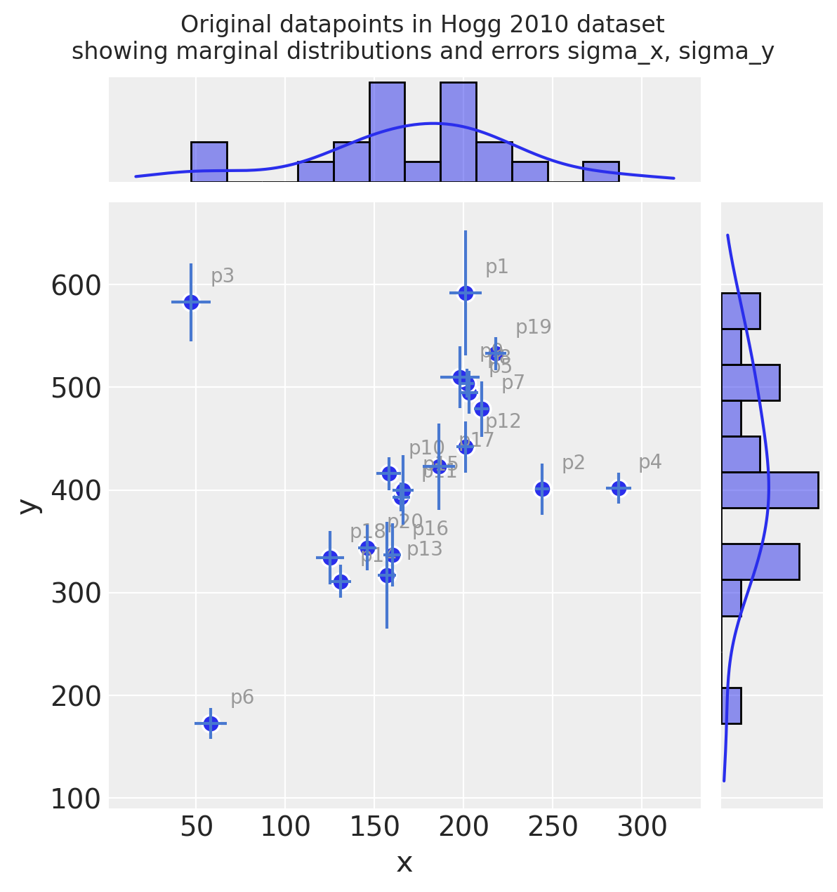
Observe:
Even judging just by eye, you can see these observations mostly fall on / around a straight line with positive gradient
It looks like a few of the datapoints may be outliers from such a line
Measurement error (independently on x and y) varies across the observations
2. Basic Feature Engineering#
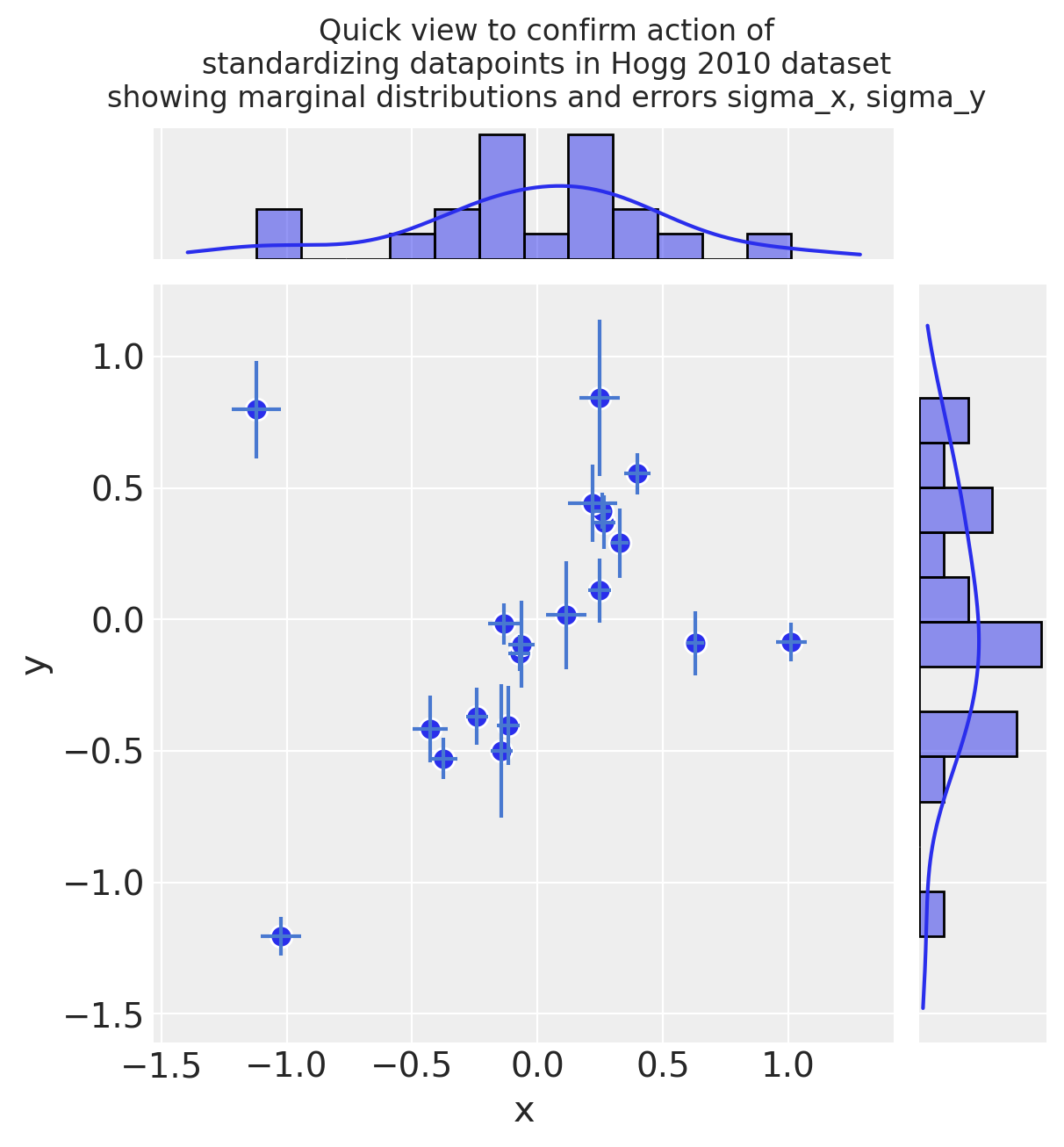
2.1 Transform and standardize dataset#
It’s common practice to standardize the input values to a linear model, because this leads to coefficients sitting in the same range and being more directly comparable. e.g. this is noted in Gelman [2008]
So, following Gelman’s paper above, we’ll divide by 2 s.d. here
since this model is very simple, we just standardize directly, rather than using e.g. a
scikit-learnFunctionTransformerignoring
rho_xyfor now
Additional note on scaling the output feature y and measurement error sigma_y:
This is unconventional - typically you wouldn’t scale an output feature
However, in the Hogg model we fit a custom two-part likelihood function of Normals which encourages a globally minimised log-loss by allowing outliers to fit to their own Normal distribution. This outlier distribution is specified using a stdev stated as an offset
sigma_y_outfromsigma_yThis offset value has the effect of requiring
sigma_yto be restated in the same scale as the stdev ofy
Standardize (mean center and divide by 2 sd):
dfhoggs = (dfhogg[["x", "y"]] - dfhogg[["x", "y"]].mean(0)) / (2 * dfhogg[["x", "y"]].std(0))
dfhoggs["sigma_x"] = dfhogg["sigma_x"] / (2 * dfhogg["x"].std())
dfhoggs["sigma_y"] = dfhogg["sigma_y"] / (2 * dfhogg["y"].std())
with plt.rc_context({"figure.constrained_layout.use": False}):
    gd = sns.jointplot(
        x="x",
        y="y",
        data=dfhoggs,
        kind="scatter",
        height=6,
        marginal_kws={"bins": 12, "kde": True, "kde_kws": {"cut": 1}},
        joint_kws={"edgecolor": "w", "linewidth": 1, "s": 80},
    )
gd.ax_joint.errorbar("x", "y", "sigma_y", "sigma_x", fmt="none", ecolor="#4878d0", data=dfhoggs)
gd.fig.suptitle(
    (
        "Quick view to confirm action of\n"
        + "standardizing datapoints in Hogg 2010 dataset\n"
        + "showing marginal distributions and errors sigma_x, sigma_y"
    ),
    y=1.08,
);
3. Simple Linear Model with no Outlier Correction#
3.1 Specify Model#
Before we get more advanced, I want to demo the fit of a simple linear model with Normal likelihood function. The priors are also Normally distributed, so this behaves like an OLS with Ridge Regression (L2 norm).
Note: the dataset also has sigma_x and rho_xy available, but for this exercise, We’ve chosen to only use sigma_y
where:
\(\beta\) = \(\{1, \beta_{j \in X_{j}}\}\) <— linear coefs in \(X_{j}\), in this case
1 + x\(\sigma\) = error term <— in this case we set this to an unpooled \(\sigma_{i}\): the measured error
sigma_yfor each datapoint
coords = {"coefs": ["intercept", "slope"], "datapoint_id": dfhoggs.index}
with pm.Model(coords=coords) as mdl_ols:
    # Define weakly informative Normal priors to give Ridge regression
    beta = pm.Normal("beta", mu=0, sigma=10, dims="coefs")

    # Define linear model
    y_est = beta[0] + beta[1] * dfhoggs["x"]

    # Define Normal likelihood
    pm.Normal("y", mu=y_est, sigma=dfhoggs["sigma_y"], observed=dfhoggs["y"], dims="datapoint_id")

pm.model_to_graphviz(mdl_ols)

3.2 Fit Model#
Note we are purposefully missing a step here for prior predictive checks.
3.2.1 Sample Posterior#
with mdl_ols:
    trc_ols = pm.sample(
        tune=5000,
        draws=500,
        chains=4,
        cores=4,
        init="advi+adapt_diag",
        n_init=50000,
    )
Sampling 4 chains for 5_000 tune and 500 draw iterations (20_000 + 2_000 draws total) took 1 seconds.
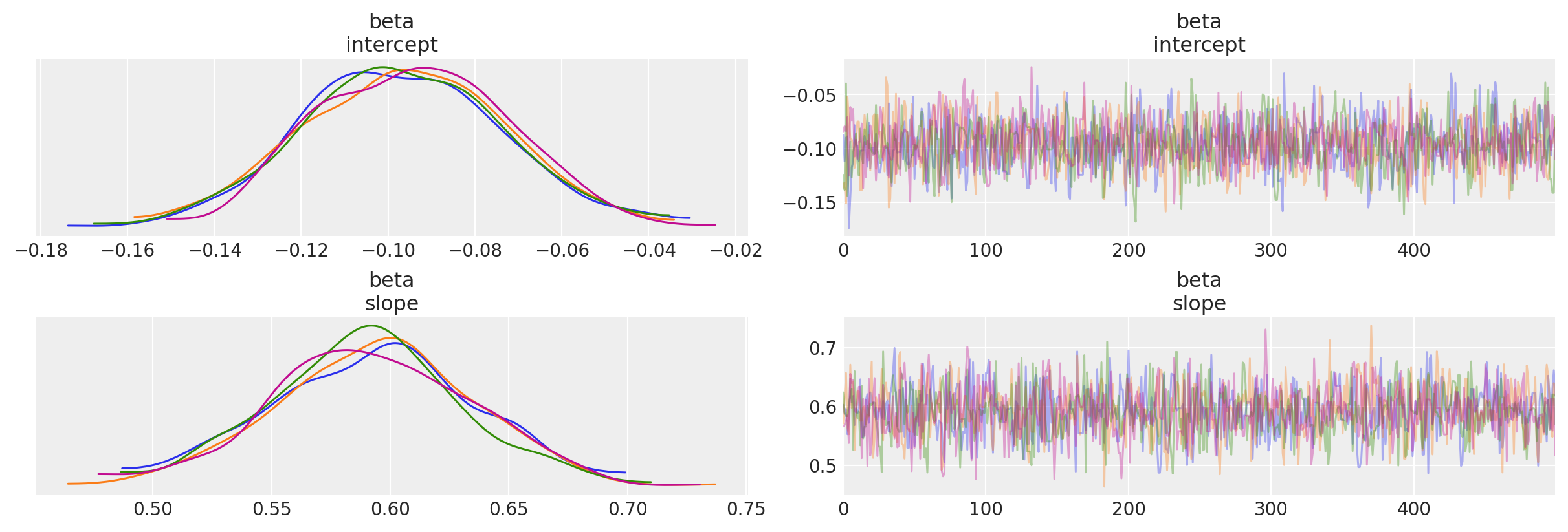
3.2.2 View Diagnostics#
NOTE: We will illustrate this OLS fit and compare to the datapoints in the final comparison plot
Traceplot
_ = az.plot_trace(trc_ols, compact=False)
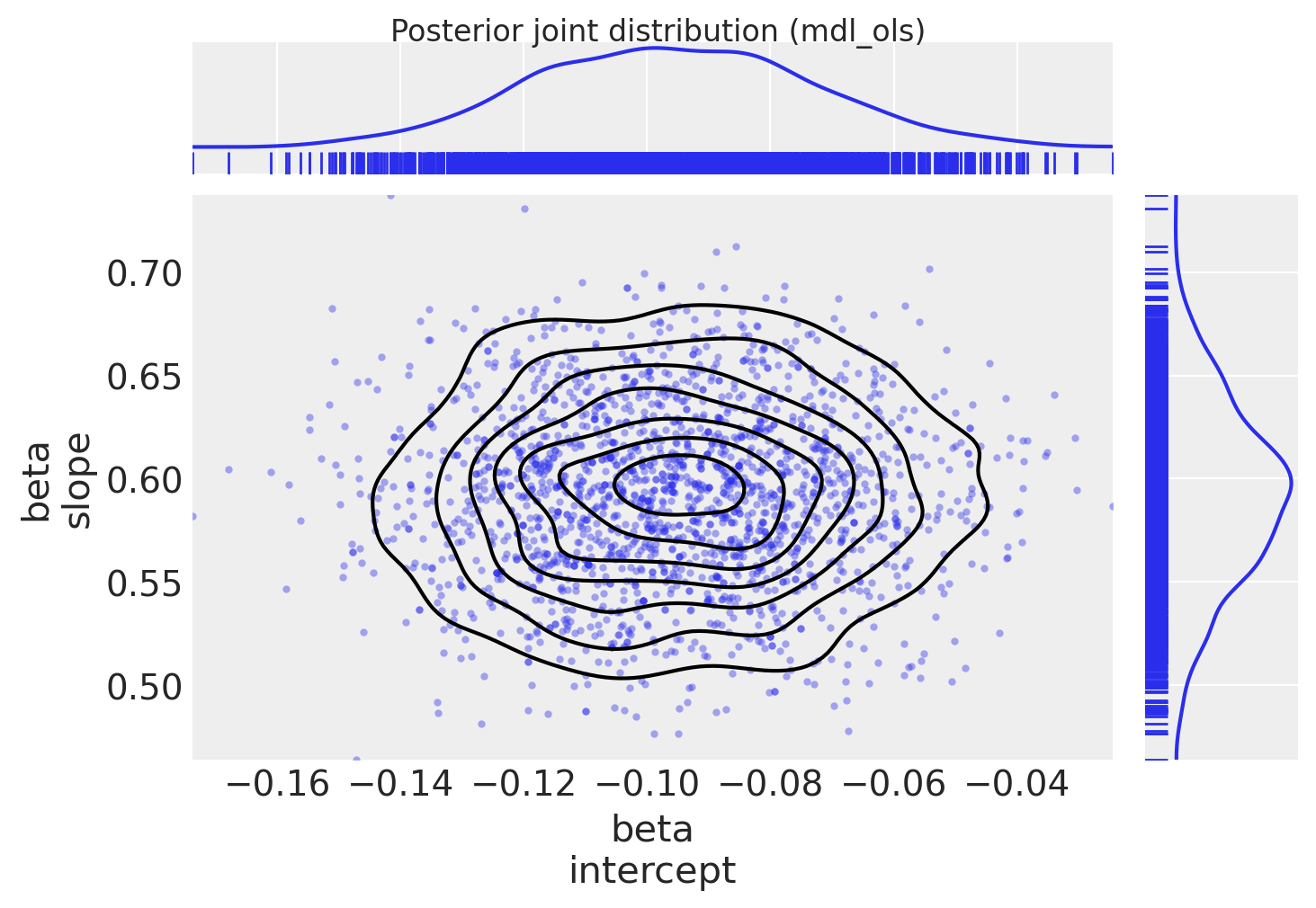
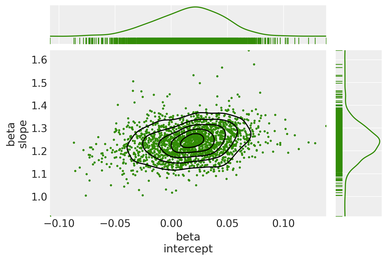
Plot posterior joint distribution (since the model has only 2 coeffs, we can easily view this as a 2D joint distribution)
marginal_kwargs = {"kind": "kde", "rug": True, "color": "C0"}
ax = az.plot_pair(
    trc_ols,
    var_names="beta",
    marginals=True,
    kind=["scatter", "kde"],
    scatter_kwargs={"color": "C0", "alpha": 0.4},
    marginal_kwargs=marginal_kwargs,
)
fig = ax[0, 0].get_figure()
fig.suptitle("Posterior joint distribution (mdl_ols)", y=1.02);
4. Simple Linear Model with Robust Student-T Likelihood#
I’ve added this brief section in order to directly compare the Student-T based method exampled in Thomas Wiecki’s notebook in the PyMC3 documentation
Instead of using a Normal distribution for the likelihood, we use a Student-T which has fatter tails. In theory this allows outliers to have a smaller influence in the likelihood estimation. This method does not produce inlier / outlier flags (it marginalizes over such a classification) but it’s simpler and faster to run than the Signal Vs Noise model below, so a comparison seems worthwhile.
4.1 Specify Model#
In this modification, we allow the likelihood to be more robust to outliers (have fatter tails)
where:
\(\beta\) = \(\{1, \beta_{j \in X_{j}}\}\) <— linear coefs in \(X_{j}\), in this case
1 + x\(\sigma\) = error term <— in this case we set this to an unpooled \(\sigma_{i}\): the measured error
sigma_yfor each datapoint\(\nu\) = degrees of freedom <— allowing a pdf with fat tails and thus less influence from outlier datapoints
Note: the dataset also has sigma_x and rho_xy available, but for this exercise, I’ve chosen to only use sigma_y
with pm.Model(coords=coords) as mdl_studentt:
    # define weakly informative Normal priors to give Ridge regression
    beta = pm.Normal("beta", mu=0, sigma=10, dims="coefs")

    # define linear model
    y_est = beta[0] + beta[1] * dfhoggs["x"]

    # define prior for StudentT degrees of freedom
    # InverseGamma has nice properties:
    # it's continuous and has support x ∈ (0, inf)
    nu = pm.InverseGamma("nu", alpha=1, beta=1)

    # define Student T likelihood
    pm.StudentT(
        "y", mu=y_est, sigma=dfhoggs["sigma_y"], nu=nu, observed=dfhoggs["y"], dims="datapoint_id"
    )

pm.model_to_graphviz(mdl_studentt)

4.2 Fit Model#
4.2.1 Sample Posterior#
with mdl_studentt:
    trc_studentt = pm.sample(
        tune=5000,
        draws=500,
        chains=4,
        cores=4,
        init="advi+adapt_diag",
        n_init=50000,
    )
Sampling 4 chains for 5_000 tune and 500 draw iterations (20_000 + 2_000 draws total) took 2 seconds.
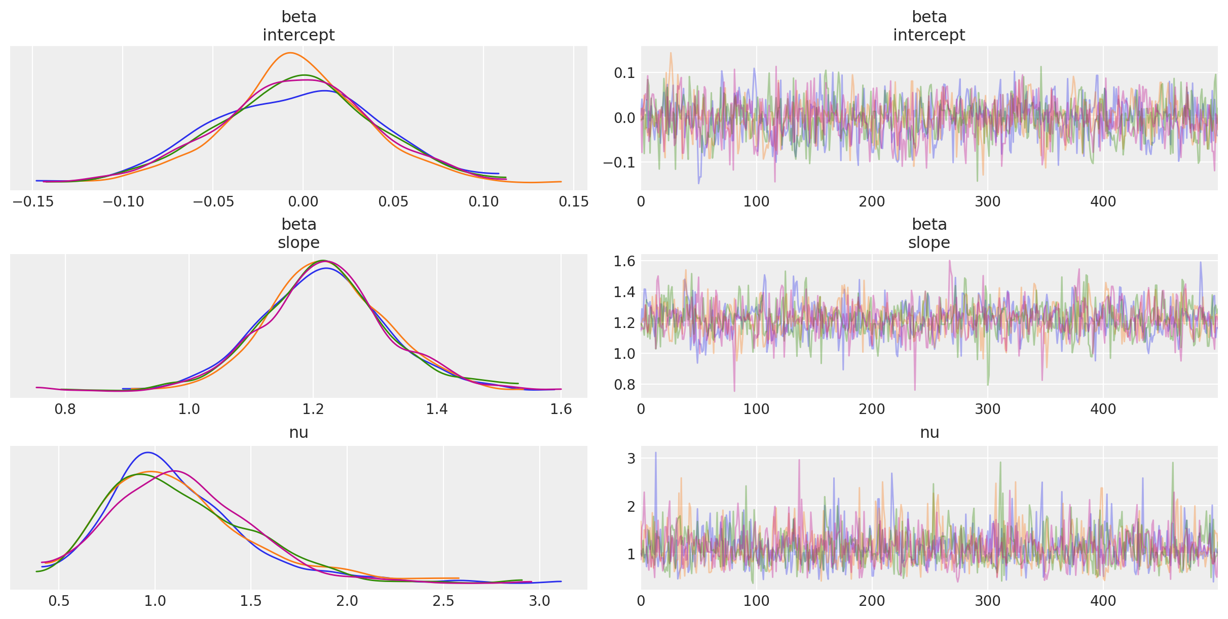
4.2.2 View Diagnostics#
NOTE: We will illustrate this StudentT fit and compare to the datapoints in the final comparison plot
Traceplot
_ = az.plot_trace(trc_studentt, compact=False);
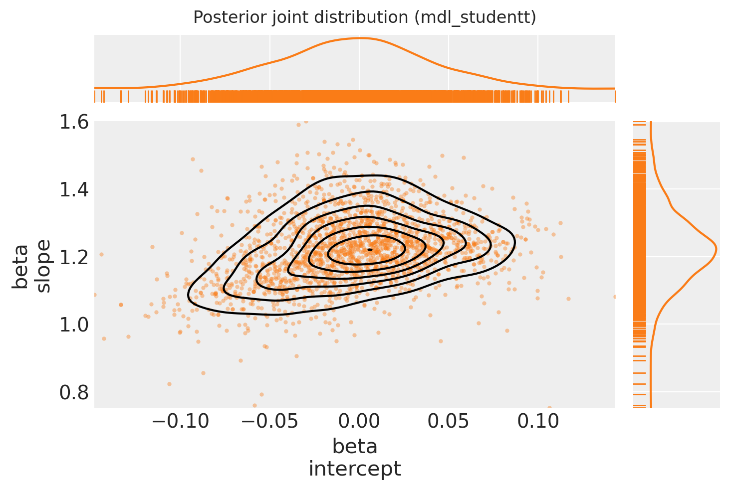
Plot posterior joint distribution
marginal_kwargs["color"] = "C1"
ax = az.plot_pair(
    trc_studentt,
    var_names="beta",
    kind=["scatter", "kde"],
    divergences=True,
    marginals=True,
    marginal_kwargs=marginal_kwargs,
    scatter_kwargs={"color": "C1", "alpha": 0.4},
)
ax[0, 0].get_figure().suptitle("Posterior joint distribution (mdl_studentt)");
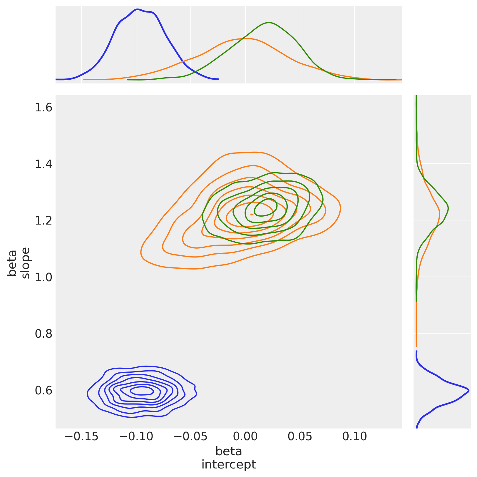
4.2.3 View the shift in posterior joint distributions from OLS to StudentT#
marginal_kwargs["rug"] = False
marginal_kwargs["color"] = "C0"
ax = az.plot_pair(
    trc_ols,
    var_names="beta",
    kind=["scatter", "kde"],
    divergences=True,
    figsize=[12, 12],
    marginals=True,
    marginal_kwargs=marginal_kwargs,
    scatter_kwargs={"color": "C0", "alpha": 0.4},
    kde_kwargs={"contour_kwargs": {"colors": "C0"}},
)

marginal_kwargs["color"] = "C1"
az.plot_pair(
    trc_studentt,
    var_names="beta",
    kind=["scatter", "kde"],
    divergences=True,
    marginals=True,
    marginal_kwargs=marginal_kwargs,
    scatter_kwargs={"color": "C1", "alpha": 0.4},
    kde_kwargs={"contour_kwargs": {"colors": "C1"}},
    ax=ax,
)

ax[0, 0].get_figure().suptitle(
    "Posterior joint distributions\n(showing general movement from OLS to StudentT)"
);
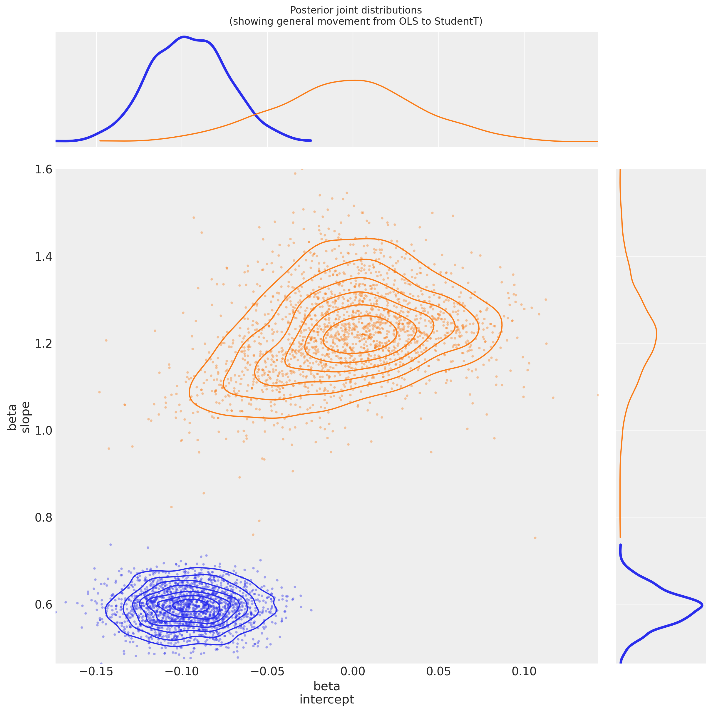
Observe:
Both
betaparameters appear to have greater variance than in the OLS regressionThis is due to \(\nu\) appearing to converge to a value
nu ~ 1, indicating that a fat-tailed likelihood has a better fit than a thin-tailed oneThe parameter
beta[intercept]has moved much closer to \(0\), which is interesting: if the theoretical relationshipy ~ f(x)has no offset, then for this mean-centered dataset, the intercept should indeed be \(0\): it might easily be getting pushed off-course by outliers in the OLS model.The parameter
beta[slope]has accordingly become greater: perhaps moving closer to the theoretical functionf(x)
5. Linear Model with Custom Likelihood to Distinguish Outliers: Hogg Method#
Please read the paper (Hogg 2010) and Jake Vanderplas’ code for more complete information about the modelling technique.
The general idea is to create a ‘mixture’ model whereby datapoints can be described by either:
the proposed (linear) model (thus a datapoint is an inlier), or
a second model, which for convenience we also propose to be linear, but allow it to have a different mean and variance (thus a datapoint is an outlier)
5.1 Specify Model#
The likelihood is evaluated over a mixture of two likelihoods, one for ‘inliers’, one for ‘outliers’. A Bernoulli distribution is used to randomly assign datapoints in N to either the inlier or outlier groups, and we sample the model as usual to infer robust model parameters and inlier / outlier flags:
where:
\(B_{i}\) is Bernoulli-distributed \(B_{i} \in \{0_{(inlier)},1_{(outlier)}\}\)
\(\mu_{in} = \beta^{T} \vec{x}_{i}\) as before for inliers, where \(\beta\) = \(\{1, \beta_{j \in X_{j}}\}\) <— linear coefs in \(X_{j}\), in this case
1 + x\(\sigma_{in}\) = noise term <— in this case we set this to an unpooled \(\sigma_{i}\): the measured error
sigma_yfor each datapoint\(\mu_{out}\) <— is a random pooled variable for outliers
\(\sigma_{out}\) = additional noise term <— is a random unpooled variable for outliers
This notebook uses Potential() class combined with logp to create a likelihood and build this model where a feature is not observed, here the Bernoulli switching variable.
Usage of Potential is not discussed. Other resources are available that are worth referring to for details
on Potential usage:
Junpenglao’s presentation on likelihoods at PyData Berlin July 2018
worked examples on Discourse and Cross Validated.
and the pymc3 port of CamDP’s Probabilistic Programming and Bayesian Methods for Hackers, Chapter 5 Loss Functions, Example: Optimizing for the Showcase on The Price is Right
Other examples using it, search for the
pymc3.Potentialtag on the left sidebar
with pm.Model(coords=coords) as mdl_hogg:
    # state input data as Theano shared vars
    tsv_x = pm.ConstantData("tsv_x", dfhoggs["x"], dims="datapoint_id")
    tsv_y = pm.ConstantData("tsv_y", dfhoggs["y"], dims="datapoint_id")
    tsv_sigma_y = pm.ConstantData("tsv_sigma_y", dfhoggs["sigma_y"], dims="datapoint_id")

    # weakly informative Normal priors (L2 ridge reg) for inliers
    beta = pm.Normal("beta", mu=0, sigma=10, dims="coefs")

    # linear model for mean for inliers
    y_est_in = beta[0] + beta[1] * tsv_x  # dims="obs_id"

    # very weakly informative mean for all outliers
    y_est_out = pm.Normal("y_est_out", mu=0, sigma=10, initval=pm.floatX(0.0))

    # very weakly informative prior for additional variance for outliers
    sigma_y_out = pm.HalfNormal("sigma_y_out", sigma=10, initval=pm.floatX(1.0))

    # create in/outlier distributions to get a logp evaluated on the observed y
    # this is not strictly a pymc3 likelihood, but behaves like one when we
    # evaluate it within a Potential (which is minimised)
    inlier_logp = pm.logp(pm.Normal.dist(mu=y_est_in, sigma=tsv_sigma_y), tsv_y)
    outlier_logp = pm.logp(pm.Normal.dist(mu=y_est_out, sigma=tsv_sigma_y + sigma_y_out), tsv_y)

    # frac_outliers only needs to span [0, .5]
    # testval for is_outlier initialised in order to create class asymmetry
    frac_outliers = pm.Uniform("frac_outliers", lower=0.0, upper=0.5)
    is_outlier = pm.Bernoulli(
        "is_outlier",
        p=frac_outliers,
        initval=(np.random.rand(tsv_x.eval().shape[0]) < 0.4) * 1,
        dims="datapoint_id",
    )

    # non-sampled Potential evaluates the Normal.dist.logp's
    potential = pm.Potential(
        "obs",
        ((1 - is_outlier) * inlier_logp).sum() + (is_outlier * outlier_logp).sum(),
    )
5.2 Fit Model#
5.2.1 Sample Posterior#
Note that pm.sample conveniently and automatically creates the compound sampling process to:
sample a Bernoulli variable (the class
is_outlier) using a discrete samplersample the continuous variables using a continuous sampler
Further note:
This also means we can’t initialise using ADVI, so will init using
jitter+adapt_diagIn order to pass
kwargsto a particular stepper, wrap them in a dict addressed to the lowercased name of the stepper e.g.nuts={'target_accept': 0.85}
with mdl_hogg:
    trc_hogg = pm.sample(
        tune=10000,
        draws=500,
        chains=4,
        cores=4,
        init="jitter+adapt_diag",
        nuts={"target_accept": 0.99},
    )
Sampling 4 chains for 10_000 tune and 500 draw iterations (40_000 + 2_000 draws total) took 27 seconds.
/Users/benjamv/mambaforge/envs/pymc_env/lib/python3.10/site-packages/arviz/stats/diagnostics.py:584: RuntimeWarning: invalid value encountered in scalar divide
  (between_chain_variance / within_chain_variance + num_samples - 1) / (num_samples)
5.2.2 View Diagnostics#
We will illustrate this model fit and compare to the datapoints in the final comparison plot
rvs = ["beta", "y_est_out", "sigma_y_out", "frac_outliers"]
_ = az.plot_trace(trc_hogg, var_names=rvs, compact=False);
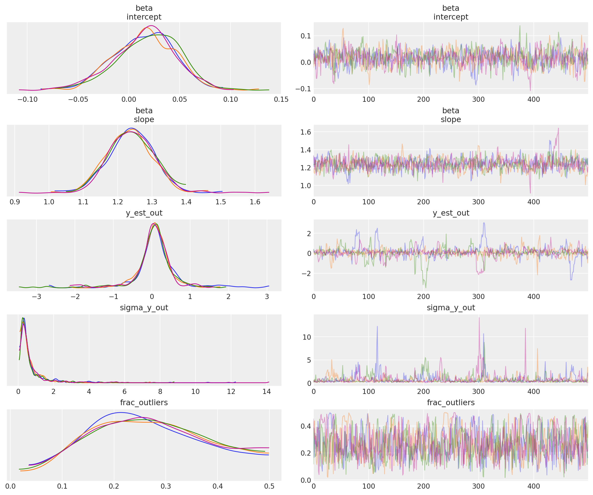
Observe:
At the default
target_accept = 0.8there are lots of divergences, indicating this is not a particularly stable modelHowever, at
target_accept = 0.9(and increasingtunefrom 5000 to 10000), the traces exhibit fewer divergences and appear slightly better behaved.The traces for the inlier model
betaparameters, and for outlier model parametery_est_out(the mean) look reasonably convergedThe traces for outlier model param
y_sigma_out(the additional pooled variance) occasionally go a bit wildIt’s interesting that
frac_outliersis so dispersed: that’s quite a flat distribution: suggests that there are a few datapoints where their inlier/outlier status is subjectiveIndeed as Thomas noted in his v2.0 Notebook, because we’re explicitly modeling the latent label (inlier/outlier) as binary choice the sampler could have a problem - rewriting this model into a marginal mixture model would be better.
Simple trace summary inc rhat
az.summary(trc_hogg, var_names=rvs)
| mean | sd | hdi_3% | hdi_97% | mcse_mean | mcse_sd | ess_bulk | ess_tail | r_hat | |
|---|---|---|---|---|---|---|---|---|---|
| beta[intercept] | 0.016 | 0.031 | -0.044 | 0.069 | 0.001 | 0.001 | 795.0 | 747.0 | 1.00 |
| beta[slope] | 1.239 | 0.068 | 1.124 | 1.365 | 0.003 | 0.002 | 764.0 | 845.0 | 1.01 |
| y_est_out | 0.073 | 0.540 | -0.977 | 1.108 | 0.032 | 0.024 | 433.0 | 295.0 | 1.01 |
| sigma_y_out | 0.724 | 0.992 | 0.073 | 2.095 | 0.051 | 0.036 | 429.0 | 423.0 | 1.01 |
| frac_outliers | 0.268 | 0.109 | 0.084 | 0.472 | 0.005 | 0.004 | 554.0 | 656.0 | 1.00 |
Plot posterior joint distribution
(This is a particularly useful diagnostic in this case where we see a lot of divergences in the traces: maybe the model specification leads to weird behaviours)
marginal_kwargs["color"] = "C2"
marginal_kwargs["rug"] = True
x = az.plot_pair(
    data=trc_hogg,
    var_names="beta",
    kind=["kde", "scatter"],
    divergences=True,
    marginals=True,
    marginal_kwargs=marginal_kwargs,
    scatter_kwargs={"color": "C2"},
)
ax[0, 0].get_figure().suptitle("Posterior joint distribution (mdl_hogg)");
5.2.3 View the shift in posterior joint distributions from OLS to StudentT to Hogg#
kde_kwargs = {"contour_kwargs": {"colors": "C0", "zorder": 4}, "contourf_kwargs": {"alpha": 0}}
marginal_kwargs["rug"] = False
marginal_kwargs["color"] = "C0"
ax = az.plot_pair(
    trc_ols,
    var_names="beta",
    kind="kde",
    divergences=True,
    marginals=True,
    marginal_kwargs={"color": "C0"},
    kde_kwargs=kde_kwargs,
    figsize=(8, 8),
)

marginal_kwargs["color"] = "C1"
kde_kwargs["contour_kwargs"]["colors"] = "C1"
az.plot_pair(
    trc_studentt,
    var_names="beta",
    kind="kde",
    divergences=True,
    marginals=True,
    marginal_kwargs=marginal_kwargs,
    kde_kwargs=kde_kwargs,
    ax=ax,
)

marginal_kwargs["color"] = "C2"
kde_kwargs["contour_kwargs"]["colors"] = "C2"
az.plot_pair(
    data=trc_hogg,
    var_names="beta",
    kind="kde",
    divergences=True,
    marginals=True,
    marginal_kwargs=marginal_kwargs,
    kde_kwargs=kde_kwargs,
    ax=ax,
    show=True,
)
ax[0, 0].get_figure().suptitle(
    "Posterior joint distributions" + "\nOLS, StudentT, and Hogg (inliers)"
);
Observe:
The
hogg_inlierandstudenttmodels converge to similar ranges forb0_interceptandb1_slope, indicating that the (unshown)hogg_outliermodel might perform a similar job to the fat tails of thestudenttmodel: allowing greater log probability away from the main linear distribution in the datapointsAs expected, (since it’s a Normal) the
hogg_inlierposterior has thinner tails and more probability mass concentrated about the central valuesThe
hogg_inliermodel also appears to have moved farther away from both theolsandstudenttmodels on theb0_intercept, suggesting that the outliers really distort that particular dimension
5.3 Declare Outliers#
5.3.1 View ranges for inliers / outlier predictions#
At each step of the traces, each datapoint may be either an inlier or outlier. We hope that the datapoints spend an unequal time being one state or the other, so let’s take a look at the simple count of states for each of the 20 datapoints.
dfm_outlier_results = trc_hogg.posterior.is_outlier.to_dataframe().reset_index()

with plt.rc_context({"figure.constrained_layout.use": False}):
    gd = sns.catplot(
        y="datapoint_id",
        x="is_outlier",
        data=dfm_outlier_results,
        kind="point",
        join=False,
        height=6,
        aspect=2,
    )
_ = gd.fig.axes[0].set(xlim=(-0.05, 1.05), xticks=np.arange(0, 1.1, 0.1))
_ = gd.fig.axes[0].axvline(x=0, color="b", linestyle=":")
_ = gd.fig.axes[0].axvline(x=1, color="r", linestyle=":")
_ = gd.fig.axes[0].yaxis.grid(True, linestyle="-", which="major", color="w", alpha=0.4)
_ = gd.fig.suptitle(
    ("For each datapoint, distribution of outlier classification " + "over the trace"),
    y=1.04,
    fontsize=16,
)
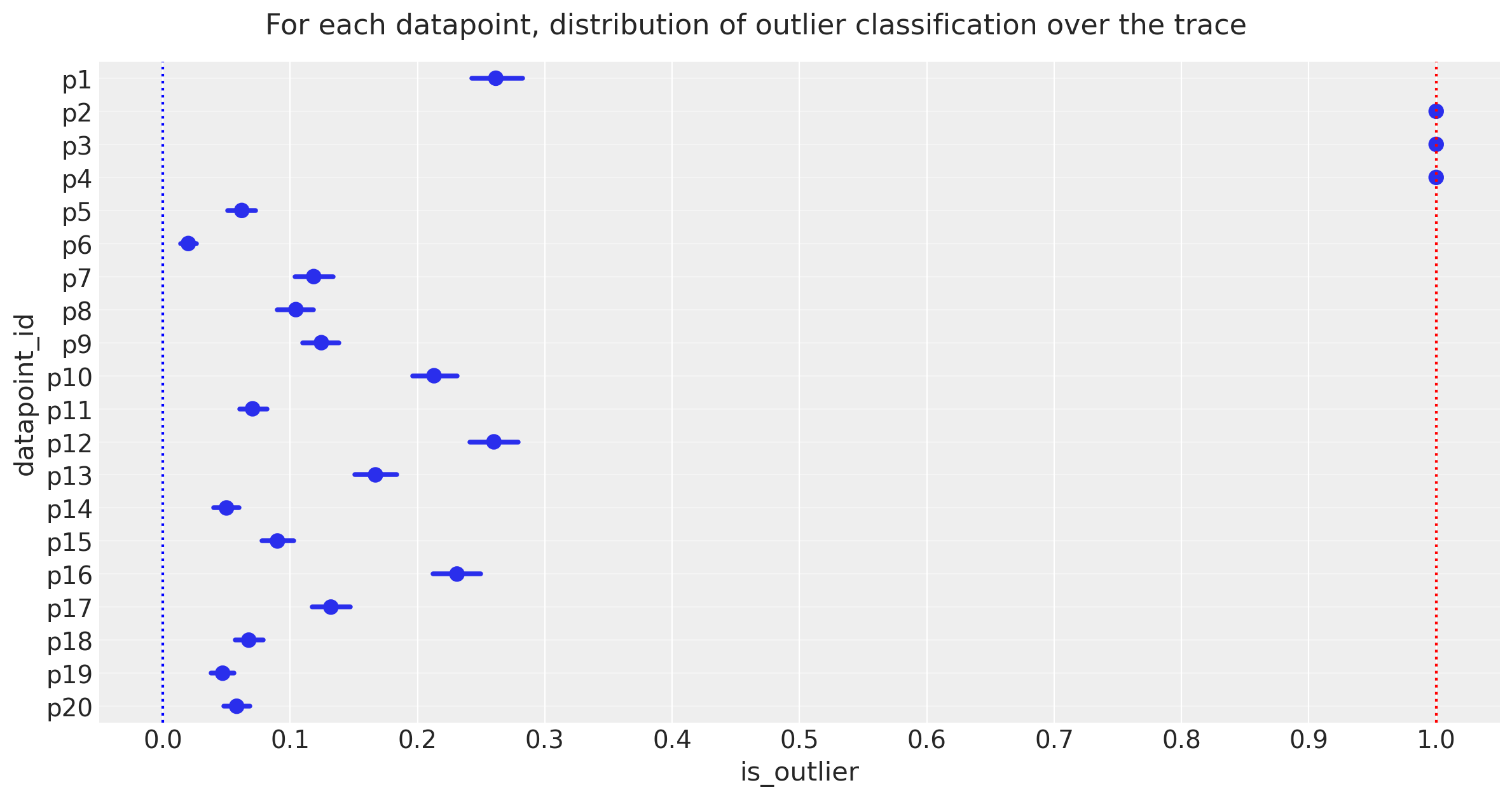
Observe:
The plot above shows the proportion of samples in the traces in which each datapoint is marked as an outlier, expressed as a percentage.
3 points [p2, p3, p4] spend >=95% of their time as outliers
Note the mean posterior value of
frac_outliers ~ 0.27, corresponding to approx 5 or 6 of the 20 datapoints: we might investigate datapoints[p1, p12, p16]to see if they lean towards being outliers
The 95% cutoff we choose is subjective and arbitrary, but I prefer it for now, so let’s declare these 3 to be outliers and see how it looks compared to Jake Vanderplas’ outliers, which were declared in a slightly different way as points with means above 0.68.
5.3.2 Declare outliers#
Note:
I will declare outliers to be datapoints that have value == 1 at the 5-percentile cutoff, i.e. in the percentiles from 5 up to 100, their values are 1.
Try for yourself altering cutoff to larger values, which leads to an objective ranking of outlier-hood.
cutoff = 0.05
dfhoggs["classed_as_outlier"] = (
    trc_hogg.posterior["is_outlier"].quantile(cutoff, dim=("chain", "draw")) == 1
)
dfhoggs["classed_as_outlier"].value_counts()
False    17
True      3
Name: classed_as_outlier, dtype: int64
Also add flag for points to be investigated. Will use this to annotate final plot
dfhoggs["annotate_for_investigation"] = (
    trc_hogg.posterior["is_outlier"].quantile(0.75, dim=("chain", "draw")) == 1
)
dfhoggs["annotate_for_investigation"].value_counts()
False    15
True      5
Name: annotate_for_investigation, dtype: int64
5.4 Posterior Prediction Plots for OLS vs StudentT vs Hogg “Signal vs Noise”#
import xarray as xr

x = xr.DataArray(np.linspace(-3, 3, 10), dims="plot_dim")

# evaluate outlier posterior distribution for plotting
trc_hogg.posterior["outlier_mean"] = trc_hogg.posterior["y_est_out"].broadcast_like(x)

# evaluate model (inlier) posterior distributions for all 3 models
lm = lambda beta, x: beta.sel(coefs="intercept") + beta.sel(coefs="slope") * x

trc_ols.posterior["y_mean"] = lm(trc_ols.posterior["beta"], x)
trc_studentt.posterior["y_mean"] = lm(trc_studentt.posterior["beta"], x)
trc_hogg.posterior["y_mean"] = lm(trc_hogg.posterior["beta"], x)
with plt.rc_context({"figure.constrained_layout.use": False}):
    gd = sns.FacetGrid(
        dfhoggs,
        height=7,
        hue="classed_as_outlier",
        hue_order=[True, False],
        palette="Set1",
        legend_out=False,
    )

# plot hogg outlier posterior distribution
outlier_mean = az.extract(trc_hogg, var_names="outlier_mean", num_samples=400)
gd.ax.plot(x, outlier_mean, color="C3", linewidth=0.5, alpha=0.2, zorder=1)

# plot the 3 model (inlier) posterior distributions
y_mean = az.extract(trc_ols, var_names="y_mean", num_samples=200)
gd.ax.plot(x, y_mean, color="C0", linewidth=0.5, alpha=0.2, zorder=2)

y_mean = az.extract(trc_studentt, var_names="y_mean", num_samples=200)
gd.ax.plot(x, y_mean, color="C1", linewidth=0.5, alpha=0.2, zorder=3)

y_mean = az.extract(trc_hogg, var_names="y_mean", num_samples=200)
gd.ax.plot(x, y_mean, color="C2", linewidth=0.5, alpha=0.2, zorder=4)

# add legend for regression lines plotted above
line_legend = plt.legend(
    [
        Line2D([0], [0], color="C3"),
        Line2D([0], [0], color="C2"),
        Line2D([0], [0], color="C1"),
        Line2D([0], [0], color="C0"),
    ],
    ["Hogg Inlier", "Hogg Outlier", "Student-T", "OLS"],
    loc="lower right",
    title="Posterior Predictive",
)
gd.ax.add_artist(line_legend)

# plot points
_ = gd.map(
    plt.errorbar,
    "x",
    "y",
    "sigma_y",
    "sigma_x",
    marker="o",
    ls="",
    markeredgecolor="w",
    markersize=10,
    zorder=5,
).add_legend()
gd.ax.legend(loc="upper left", title="Outlier Classification")

# annotate the potential outliers
for idx, r in dfhoggs.loc[dfhoggs["annotate_for_investigation"]].iterrows():
    _ = gd.ax.annotate(
        text=idx,
        xy=(r["x"], r["y"]),
        xycoords="data",
        xytext=(7, 7),
        textcoords="offset points",
        color="k",
        zorder=4,
    )

## create xlims ylims for plotting
x_ptp = np.ptp(dfhoggs["x"].values) / 3.3
y_ptp = np.ptp(dfhoggs["y"].values) / 3.3
xlims = (dfhoggs["x"].min() - x_ptp, dfhoggs["x"].max() + x_ptp)
ylims = (dfhoggs["y"].min() - y_ptp, dfhoggs["y"].max() + y_ptp)
gd.ax.set(ylim=ylims, xlim=xlims)
gd.fig.suptitle(
    (
        "Standardized datapoints in Hogg 2010 dataset, showing "
        "posterior predictive fit for 3 models:\nOLS, StudentT and Hogg "
        '"Signal vs Noise" (inlier vs outlier, custom likelihood)'
    ),
    y=1.04,
    fontsize=14,
);
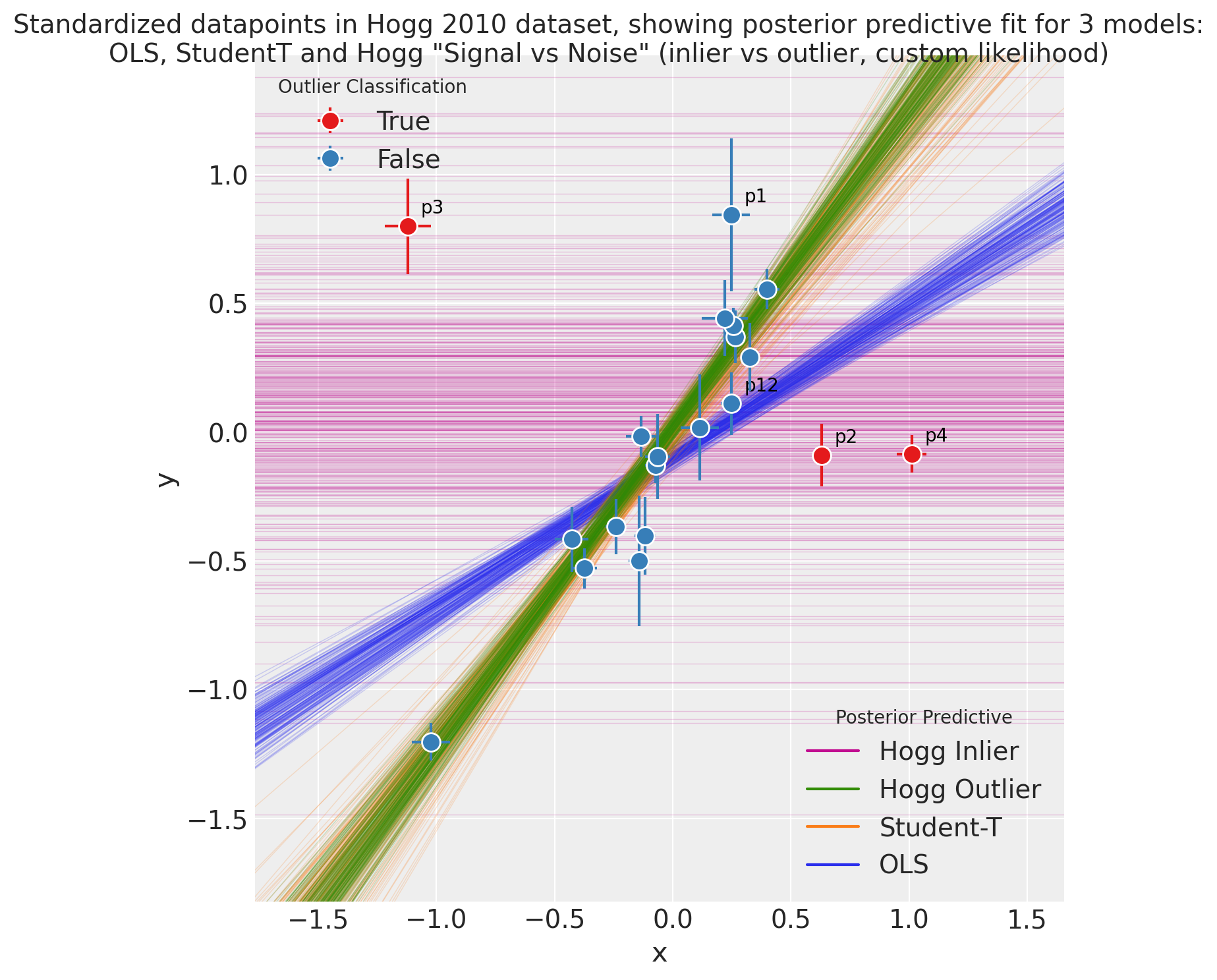
Observe:
The posterior preditive fit for:
the OLS model is shown in Green and as expected, it doesn’t appear to fit the majority of our datapoints very well, skewed by outliers
the Student-T model is shown in Orange and does appear to fit the ‘main axis’ of datapoints quite well, ignoring outliers
the Hogg Signal vs Noise model is shown in two parts:
Blue for inliers fits the ‘main axis’ of datapoints well, ignoring outliers
Red for outliers has a very large variance and has assigned ‘outlier’ points with more log likelihood than the Blue inlier model
We see that the Hogg Signal vs Noise model also yields specific estimates of which datapoints are outliers:
17 ‘inlier’ datapoints, in Blue and
3 ‘outlier’ datapoints shown in Red.
From a simple visual inspection, the classification seems fair, and agrees with Jake Vanderplas’ findings.
I’ve annotated these Red and the most outlying inliers to aid visual investigation
Overall:
the Hogg Signal vs Noise model behaves as promised, yielding a robust regression estimate and explicit labelling of inliers / outliers, but
the Hogg Signal vs Noise model is quite complex, and whilst the regression seems robust, the traceplot shoes many divergences, and the model is potentially unstable
if you simply want a robust regression without inlier / outlier labelling, the Student-T model may be a good compromise, offering a simple model, quick sampling, and a very similar estimate.
References#
David W. Hogg, Jo Bovy, and Dustin Lang. Data analysis recipes: fitting a model to data. 2010. arXiv:1008.4686.
Željko Ivezić, Andrew J. Connolly, Jacob T. VanderPlas, and Alexander Gray. Statistics, Data Mining, and Machine Learning in Astronomy: A Practical Python Guide for the Analysis of Survey Data. Princeton University Press, 2014. ISBN 9781400848911. doi:10.1515/9781400848911.
J.T. Vanderplas, A.J. Connolly, Ž. Ivezić, and A. Gray. Introduction to astroml: machine learning for astrophysics. In Conference on Intelligent Data Understanding (CIDU), 47–54. oct. 2012. doi:10.1109/CIDU.2012.6382200.
Andrew Gelman. Scaling regression inputs by dividing by two standard deviations. Statistics in medicine, 27(15):2865–2873, 2008. doi:10.1002/sim.3107.
Watermark#
%load_ext watermark
%watermark -n -u -v -iv -w -p theano,xarray
Last updated: Sun Feb 05 2023

Python implementation: CPython
Python version       : 3.10.9
IPython version      : 8.9.0

theano: not installed
xarray: 2023.1.0

numpy     : 1.24.1
arviz     : 0.14.0
pandas    : 1.5.3
pymc      : 5.0.1
seaborn   : 0.12.2
scipy     : 1.10.0
matplotlib: 3.6.3
xarray    : 2023.1.0

Watermark: 2.3.1
License notice#
All the notebooks in this example gallery are provided under the MIT License which allows modification, and redistribution for any use provided the copyright and license notices are preserved.
Citing PyMC examples#
To cite this notebook, use the DOI provided by Zenodo for the pymc-examples repository.
Important
Many notebooks are adapted from other sources: blogs, books… In such cases you should cite the original source as well.
Also remember to cite the relevant libraries used by your code.
Here is an citation template in bibtex:
@incollection{citekey,
  author    = "<notebook authors, see above>",
  title     = "<notebook title>",
  editor    = "PyMC Team",
  booktitle = "PyMC examples",
  doi       = "10.5281/zenodo.5654871"
}
which once rendered could look like: