


Regression discontinuity design analysis#
Quasi experiments involve experimental interventions and quantitative measures. However, quasi-experiments do not involve random assignment of units (e.g. cells, people, companies, schools, states) to test or control groups. This inability to conduct random assignment poses problems when making causal claims as it makes it harder to argue that any difference between a control and test group are because of an intervention and not because of a confounding factor.
The regression discontinuity design is a particular form of quasi experimental design. It consists of a control and test group, but assignment of units to conditions is chosen based upon a threshold criteria, not randomly.
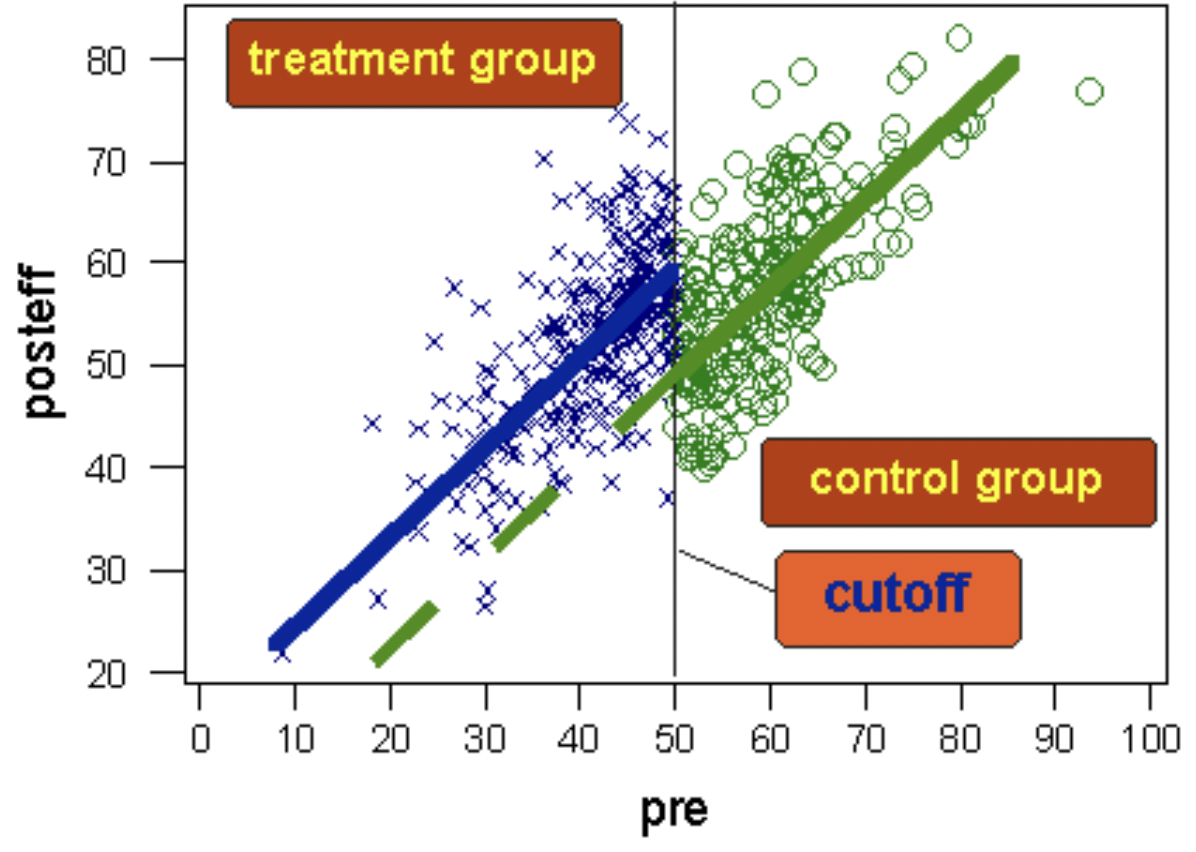
A schematic diagram of the regression discontinuity design. The dashed green line shows where we would have expected the post test scores of the test group to be if they had not received the treatment. Image taken from https://conjointly.com/kb/regression-discontinuity-design/.#
Units with very low scores are likely to differ systematically along some dimensions than units with very high scores. For example, if we look at students who achieve the highest, and students who achieve the lowest, in all likelihood there are confounding variables. Students with high scores are likely to have come from more privileged backgrounds than those with the lowest scores.
If we gave extra tuition (our experimental intervention) to students scoring in the lowest half of scores then we can easily imagine that we have large differences in some measure of privilege between test and control groups. At a first glance, this would seem to make the regression discontinuity design useless - the whole point of random assignment is to reduce or eliminate systematic biases between control and test groups. But use of a threshold would seem to maximise the differences in confounding variables between groups. Isn’t this an odd thing to do?
The key point however is that it is much less likely that students scoring just below and just above the threshold systematically differ in their degree of privilege. And so if we find evidence of a meaningful discontinuity in a post-test score in those just above and just below the threshold, then it is much more plausible that the intervention (applied according to the threshold criteria) was causally responsible.
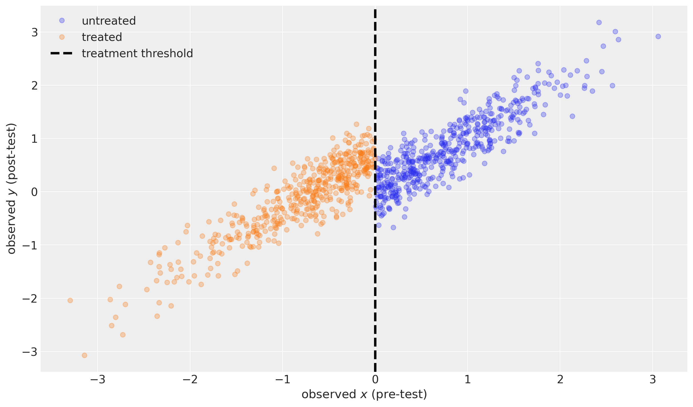
Generate simulated data#
Note that here we assume that there is negligible/zero measurement noise, but that there is some variability in the true values from pre- to post-test. It is possible to take into account measurement noise on the pre- and post-test results, but we do not engage with that in this notebook.
| x | treated | y | |
|---|---|---|---|
| 0 | -0.989121 | True | 0.050794 |
| 1 | -0.367787 | True | -0.181418 |
| 2 | 1.287925 | False | 1.345912 |
| 3 | 0.193974 | False | 0.430915 |
| 4 | 0.920231 | False | 1.229825 |
| ... | ... | ... | ... |
| 995 | -1.246726 | True | -0.819665 |
| 996 | 0.090428 | False | 0.006909 |
| 997 | 0.370658 | False | -0.027703 |
| 998 | -1.063268 | True | 0.008132 |
| 999 | 0.239116 | False | 0.604780 |
1000 rows × 3 columns
Sharp regression discontinuity model#
We can define our Bayesian regression discontinuity model as:
where:
\(\Delta\) is the size of the discontinuity,
\(\sigma\) is the standard deviation of change in the pre- to post-test scores,
\(x_i\) and \(y_i\) are observed pre- and post-test measures for unit \(i\), and
\(treated_i\) is an observed indicator variable (0 for control group, 1 for test group).
Notes:
We make the simplifying assumption of no measurement error.
Here, we confine ourselves to the situation where we use the same measure (e.g. heart rate, educational attainment, upper arm circumference) for both the pre-test (\(x\)) and post-test (\(y\)). So the untreated post-test measure can be modelled as \(y \sim \text{Normal}(\mu=x, \sigma)\).
In the case that the pre- and post-test measuring instruments where not identical, then we would want to build slope and intercept parameters into \(\mu\) to capture the ‘exchange rate’ between the pre- and post-test measures.
We assume we have accurately observed whether a unit has been treated or not. That is, this model assumes a sharp discontinuity with no uncertainty.
with pm.Model() as model:
    x = pm.MutableData("x", df.x, dims="obs_id")
    treated = pm.MutableData("treated", df.treated, dims="obs_id")
    sigma = pm.HalfNormal("sigma", 1)
    delta = pm.Cauchy("effect", alpha=0, beta=1)
    mu = pm.Deterministic("mu", x + (delta * treated), dims="obs_id")
    pm.Normal("y", mu=mu, sigma=sigma, observed=df.y, dims="obs_id")

pm.model_to_graphviz(model)

Inference#
with model:
    idata = pm.sample(random_seed=RANDOM_SEED)
Auto-assigning NUTS sampler...
Initializing NUTS using jitter+adapt_diag...
Multiprocess sampling (4 chains in 4 jobs)
NUTS: [sigma, effect]
Sampling 4 chains for 1_000 tune and 1_000 draw iterations (4_000 + 4_000 draws total) took 1 seconds.
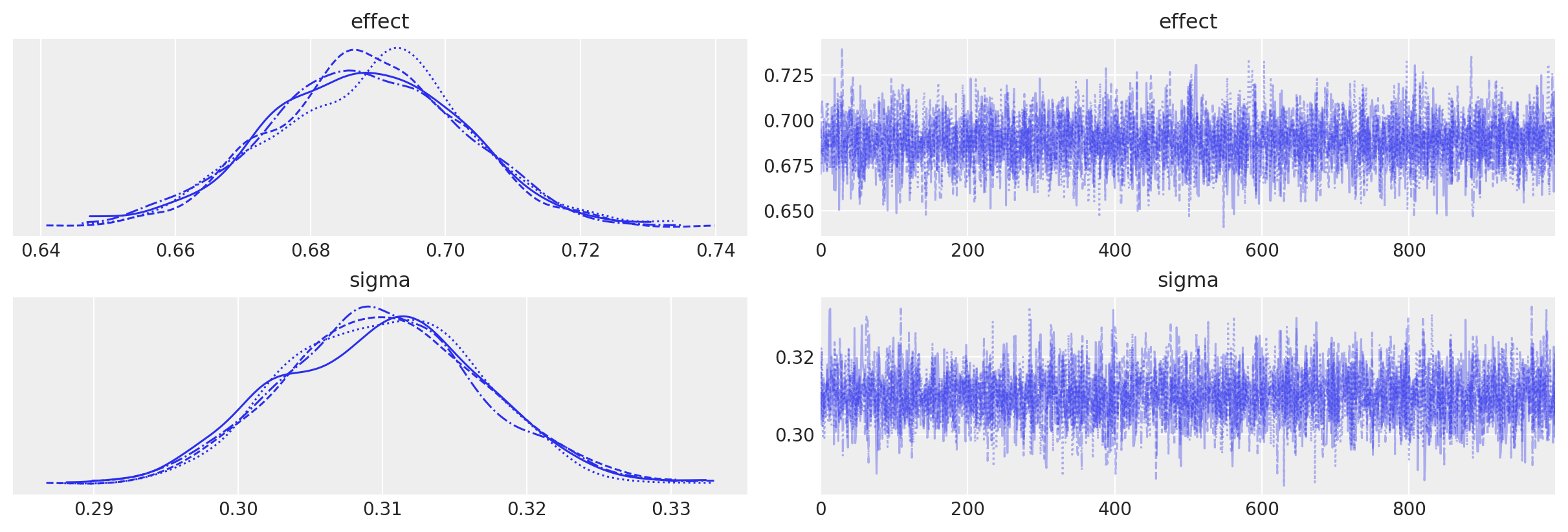
We can see that we get no sampling warnings, and that plotting the MCMC traces shows no issues.
az.plot_trace(idata, var_names=["effect", "sigma"]);
We can also see that we are able to accurately recover the true discontinuity magnitude (left) and the standard deviation of the change in units between pre- and post-test (right).
az.plot_posterior(
    idata, var_names=["effect", "sigma"], ref_val=[treatment_effect, sd], hdi_prob=0.95
);
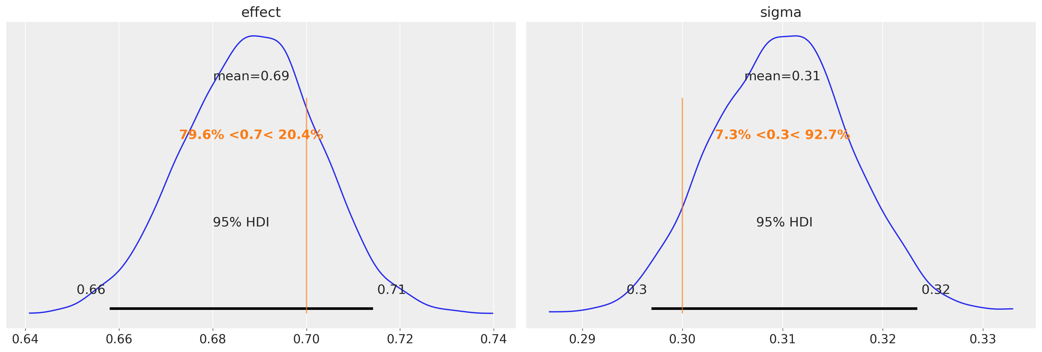
The most important thing is the posterior over the effect parameter. We can use that to base a judgement about the strength of the effect (e.g. through the 95% credible interval) or the presence/absence of an effect (e.g. through a Bayes Factor or ROPE).
Counterfactual questions#
We can use posterior prediction to ask what would we expect to see if:
no units were exposed to the treatment (blue shaded region, which is very narrow)
all units were exposed to the treatment (orange shaded region).
Technical note: Formally we are doing posterior prediction of y. Running pm.sample_posterior_predictive multiple times with different random seeds will result in new and different samples of y each time. However, this is not the case (we are not formally doing posterior prediction) for mu. This is because mu is a deterministic function (mu = x + delta*treated), so for our already obtained posterior samples of delta, the values of mu will be entirely determined by the values of x and treated data).
# MODEL EXPECTATION WITHOUT TREATMENT ------------------------------------
# probe data
_x = np.linspace(np.min(df.x), np.max(df.x), 500)
_treated = np.zeros(_x.shape)

# posterior prediction (see technical note above)
with model:
    pm.set_data({"x": _x, "treated": _treated})
    ppc = pm.sample_posterior_predictive(idata, var_names=["mu", "y"])

# plotting
ax = plot_data(df)
az.plot_hdi(
    _x,
    ppc.posterior_predictive["mu"],
    color="C0",
    hdi_prob=0.95,
    ax=ax,
    fill_kwargs={"label": r"$\mu$ untreated"},
)

# MODEL EXPECTATION WITH TREATMENT ---------------------------------------
# probe data
_x = np.linspace(np.min(df.x), np.max(df.x), 500)
_treated = np.ones(_x.shape)

# posterior prediction (see technical note above)
with model:
    pm.set_data({"x": _x, "treated": _treated})
    ppc = pm.sample_posterior_predictive(idata, var_names=["mu", "y"])

# plotting
az.plot_hdi(
    _x,
    ppc.posterior_predictive["mu"],
    color="C1",
    hdi_prob=0.95,
    ax=ax,
    fill_kwargs={"label": r"$\mu$ treated"},
)
ax.legend()
Sampling: [y]
Sampling: [y]
<matplotlib.legend.Legend at 0x12ff8bfd0>
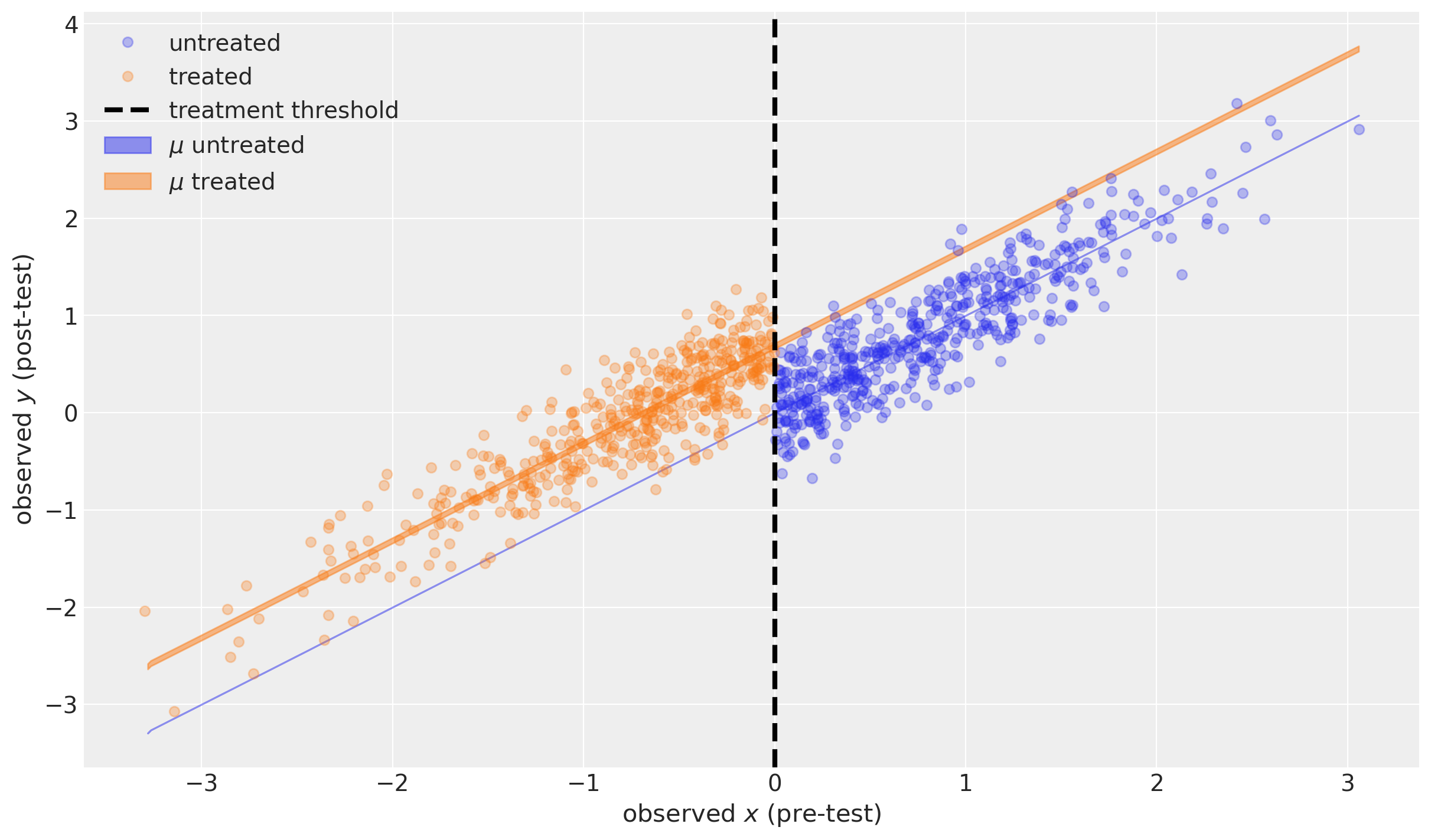
The blue shaded region shows the 95% credible region of the expected value of the post-test measurement for a range of possible pre-test measures, in the case of no treatment. This is actually infinitely narrow because this particular model assumes \(\mu=x\) (see above).
The orange shaded region shows the 95% credible region of the expected value of the post-test measurement for a range of possible pre-test measures in the case of treatment.
Both are actually very interesting as examples of counterfactual inference. We did not observe any units that were untreated below the threshold, nor any treated units above the threshold. But assuming our model is a good description of reality, we can ask the counterfactual questions “What if a unit above the threshold was treated?” and “What if a unit below the threshold was treated?”
Summary#
In this notebook we have merely touched the surface of how to analyse data from regression discontinuity designs. Arguably, we have restricted our focus to almost the simplest possible case so that we can focus upon the core properties of the approach which allows causal claims to be made.
Watermark#
%load_ext watermark
%watermark -n -u -v -iv -w -p pytensor,aeppl,xarray
Last updated: Wed Feb 01 2023

Python implementation: CPython
Python version       : 3.11.0
IPython version      : 8.9.0

pytensor: 2.8.11
aeppl   : not installed
xarray  : 2023.1.0

arviz     : 0.14.0
pandas    : 1.5.3
pymc      : 5.0.1
matplotlib: 3.6.3
numpy     : 1.24.1

Watermark: 2.3.1
License notice#
All the notebooks in this example gallery are provided under the MIT License which allows modification, and redistribution for any use provided the copyright and license notices are preserved.
Citing PyMC examples#
To cite this notebook, use the DOI provided by Zenodo for the pymc-examples repository.
Important
Many notebooks are adapted from other sources: blogs, books… In such cases you should cite the original source as well.
Also remember to cite the relevant libraries used by your code.
Here is an citation template in bibtex:
@incollection{citekey,
  author    = "<notebook authors, see above>",
  title     = "<notebook title>",
  editor    = "PyMC Team",
  booktitle = "PyMC examples",
  doi       = "10.5281/zenodo.5654871"
}
which once rendered could look like: