


Rolling Regression
Pairs trading is a famous technique in algorithmic trading that plays two stocks against each other.
For this to work, stocks must be correlated (cointegrated).
One common example is the price of gold (GLD) and the price of gold mining operations (GFI).
%matplotlib inline

import os

import arviz as az
import bambi as bmb
import matplotlib.pyplot as plt
import matplotlib.ticker as mticker
import numpy as np
import pandas as pd
import pymc3 as pm
import xarray as xr

from matplotlib import cm

print(f"Running on PyMC3 v{pm.__version__}")
Running on PyMC3 v3.11.2
RANDOM_SEED = 8927
rng = np.random.default_rng(RANDOM_SEED)

%config InlineBackend.figure_format = 'retina'
az.style.use("arviz-darkgrid")
Lets load the prices of GFI and GLD.
# from pandas_datareader import data
# prices = data.GoogleDailyReader(symbols=['GLD', 'GFI'], end='2014-8-1').read().loc['Open', :, :]
try:
    prices = pd.read_csv(os.path.join("..", "data", "stock_prices.csv")).dropna()
except FileNotFoundError:
    prices = pd.read_csv(pm.get_data("stock_prices.csv")).dropna()

prices["Date"] = pd.DatetimeIndex(prices["Date"])
prices = prices.set_index("Date")
prices_zscored = (prices - prices.mean()) / prices.std()
prices.head()
| GFI | GLD | |
|---|---|---|
| Date | ||
| 2010-01-04 | 13.55 | 109.82 |
| 2010-01-05 | 13.51 | 109.88 |
| 2010-01-06 | 13.70 | 110.71 |
| 2010-01-07 | 13.63 | 111.07 |
| 2010-01-08 | 13.72 | 111.52 |
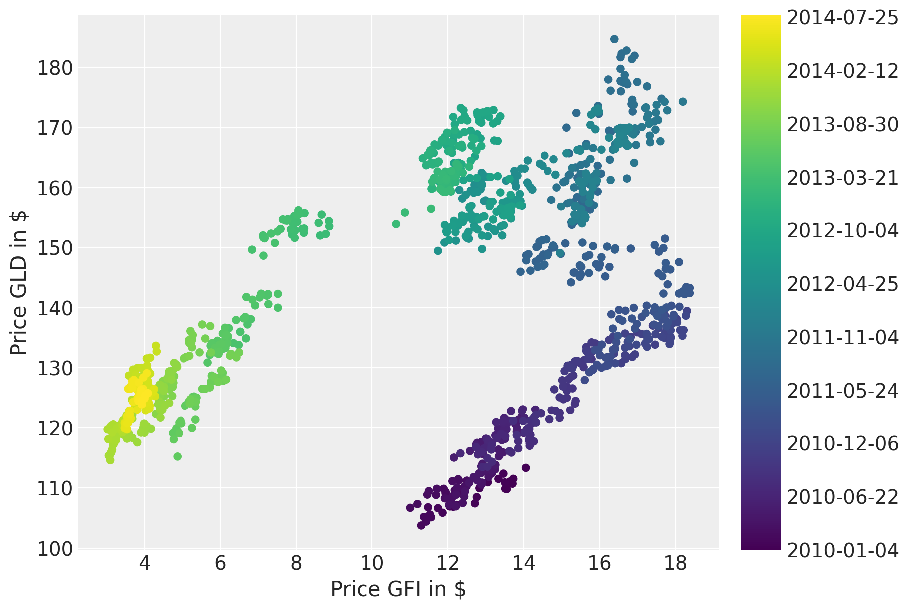
Plotting the prices over time suggests a strong correlation. However, the correlation seems to change over time.
fig = plt.figure(figsize=(9, 6))
ax = fig.add_subplot(111, xlabel=r"Price GFI in \$", ylabel=r"Price GLD in \$")
colors = np.linspace(0, 1, len(prices))
mymap = plt.get_cmap("viridis")
sc = ax.scatter(prices.GFI, prices.GLD, c=colors, cmap=mymap, lw=0)
ticks = colors[:: len(prices) // 10]
ticklabels = [str(p.date()) for p in prices[:: len(prices) // 10].index]
cb = plt.colorbar(sc, ticks=ticks)
cb.ax.set_yticklabels(ticklabels);
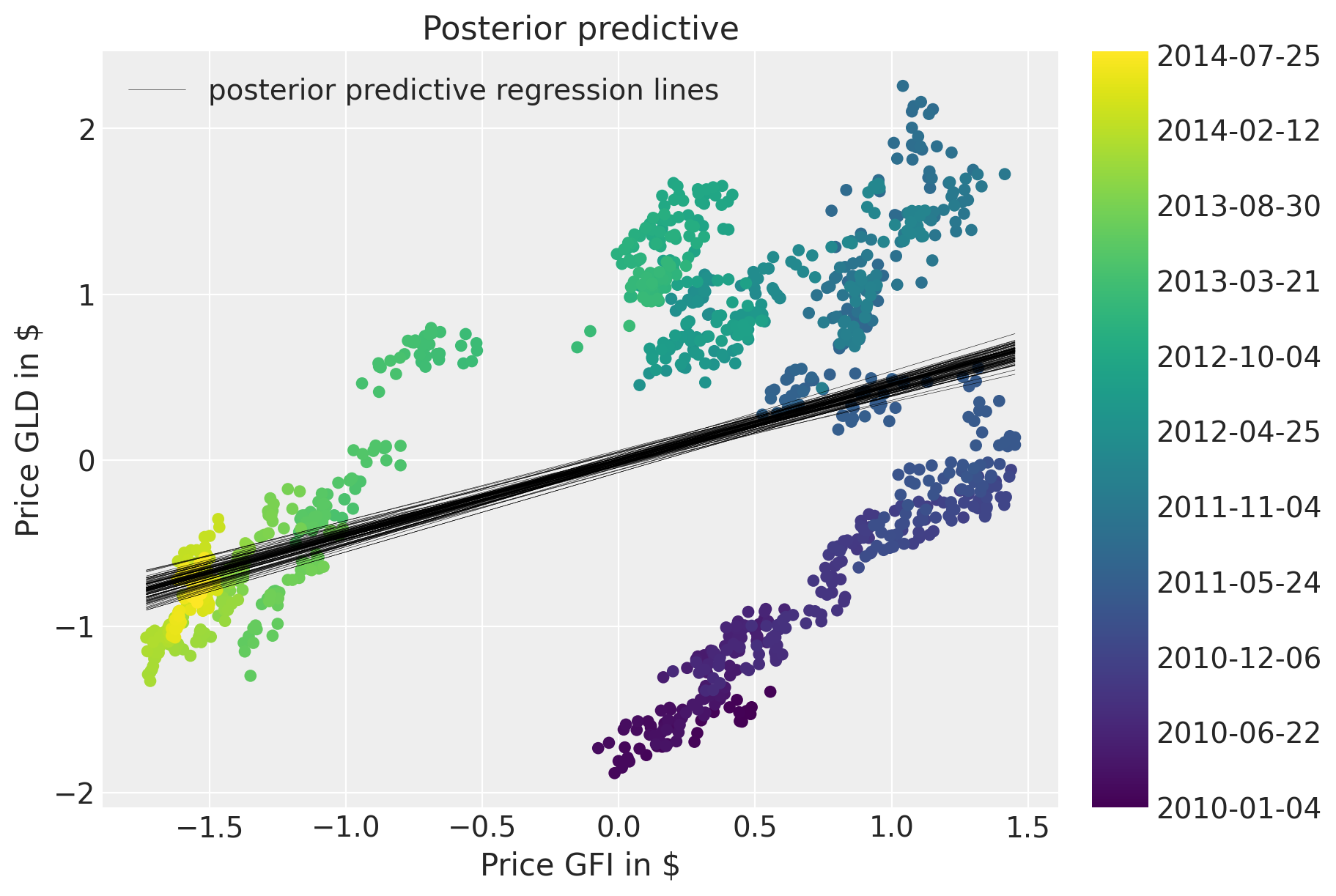
A naive approach would be to estimate a linear model and ignore the time domain.
with pm.Model() as model:  # model specifications in PyMC3 are wrapped in a with-statement
    # Define priors
    sigma = pm.HalfCauchy("sigma", beta=10, testval=1.0)
    alpha = pm.Normal("alpha", mu=0, sigma=20)
    beta = pm.Normal("beta", mu=0, sigma=20)

    # Define likelihood
    likelihood = pm.Normal(
        "y", mu=alpha + beta * prices_zscored.GFI, sigma=sigma, observed=prices_zscored.GLD
    )

    # Inference
    trace_reg = pm.sample(tune=2000, return_inferencedata=True)
Auto-assigning NUTS sampler...
Initializing NUTS using jitter+adapt_diag...
Multiprocess sampling (4 chains in 4 jobs)
NUTS: [beta, alpha, sigma]
Sampling 4 chains for 2_000 tune and 1_000 draw iterations (8_000 + 4_000 draws total) took 4 seconds.
The posterior predictive plot shows how bad the fit is.
fig = plt.figure(figsize=(9, 6))
ax = fig.add_subplot(
    111,
    xlabel=r"Price GFI in \$",
    ylabel=r"Price GLD in \$",
    title="Posterior predictive regression lines",
)
sc = ax.scatter(prices_zscored.GFI, prices_zscored.GLD, c=colors, cmap=mymap, lw=0)
pm.plot_posterior_predictive_glm(
    trace_reg,
    samples=100,
    label="posterior predictive regression lines",
    lm=lambda x, sample: sample["alpha"] + sample["beta"] * x,
    eval=np.linspace(prices_zscored.GFI.min(), prices_zscored.GFI.max(), 100),
)
cb = plt.colorbar(sc, ticks=ticks)
cb.ax.set_yticklabels(ticklabels)
ax.legend(loc=0);
/home/ada/.local/lib/python3.8/site-packages/pymc3/plots/posteriorplot.py:59: DeprecationWarning: The `plot_posterior_predictive_glm` function will migrate to Arviz in a future release.
Keep up to date with `ArviZ <https://arviz-devs.github.io/arviz/>`_ for future updates.
  warnings.warn(
Rolling regression
Next, we will build an improved model that will allow for changes in the regression coefficients over time. Specifically, we will assume that intercept and slope follow a random-walk through time. That idea is similar to the case_studies/stochastic_volatility.
First, lets define the hyper-priors for \(\sigma_\alpha^2\) and \(\sigma_\beta^2\). This parameter can be interpreted as the volatility in the regression coefficients.
with pm.Model(coords={"time": prices.index.values}) as model_randomwalk:
    # std of random walk
    sigma_alpha = pm.Exponential("sigma_alpha", 50.0)
    sigma_beta = pm.Exponential("sigma_beta", 50.0)

    alpha = pm.GaussianRandomWalk("alpha", sigma=sigma_alpha, dims="time")
    beta = pm.GaussianRandomWalk("beta", sigma=sigma_beta, dims="time")
Perform the regression given coefficients and data and link to the data via the likelihood.
with model_randomwalk:
    # Define regression
    regression = alpha + beta * prices_zscored.GFI

    # Assume prices are Normally distributed, the mean comes from the regression.
    sd = pm.HalfNormal("sd", sigma=0.1)
    likelihood = pm.Normal("y", mu=regression, sigma=sd, observed=prices_zscored.GLD)
Inference. Despite this being quite a complex model, NUTS handles it wells.
with model_randomwalk:
    trace_rw = pm.sample(tune=2000, cores=4, target_accept=0.9, return_inferencedata=True)
Auto-assigning NUTS sampler...
Initializing NUTS using jitter+adapt_diag...
Multiprocess sampling (4 chains in 4 jobs)
NUTS: [sd, beta, alpha, sigma_beta, sigma_alpha]
Sampling 4 chains for 2_000 tune and 1_000 draw iterations (8_000 + 4_000 draws total) took 1696 seconds.
The chain reached the maximum tree depth. Increase max_treedepth, increase target_accept or reparameterize.
The chain reached the maximum tree depth. Increase max_treedepth, increase target_accept or reparameterize.
The acceptance probability does not match the target. It is 0.7098579780003538, but should be close to 0.9. Try to increase the number of tuning steps.
The chain reached the maximum tree depth. Increase max_treedepth, increase target_accept or reparameterize.
The acceptance probability does not match the target. It is 0.972925816484052, but should be close to 0.9. Try to increase the number of tuning steps.
The chain reached the maximum tree depth. Increase max_treedepth, increase target_accept or reparameterize.
The rhat statistic is larger than 1.4 for some parameters. The sampler did not converge.
The estimated number of effective samples is smaller than 200 for some parameters.
Increasing the tree-depth does indeed help but it makes sampling very slow. The results look identical with this run, however.
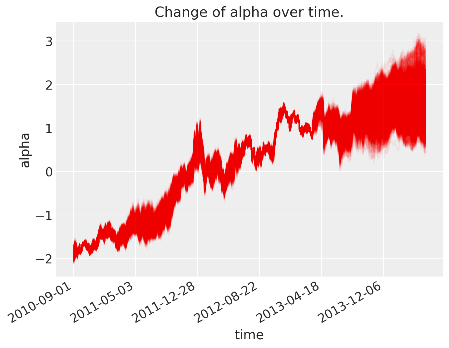
Analysis of results
As can be seen below, \(\alpha\), the intercept, changes over time.
fig = plt.figure(figsize=(8, 6), constrained_layout=False)
ax = plt.subplot(111, xlabel="time", ylabel="alpha", title="Change of alpha over time.")
ax.plot(trace_rw.posterior.stack(pooled_chain=("chain", "draw"))["alpha"], "r", alpha=0.05)

ticks_changes = mticker.FixedLocator(ax.get_xticks().tolist())
ticklabels_changes = [str(p.date()) for p in prices[:: len(prices) // 7].index]
ax.xaxis.set_major_locator(ticks_changes)
ax.set_xticklabels(ticklabels_changes)

fig.autofmt_xdate()
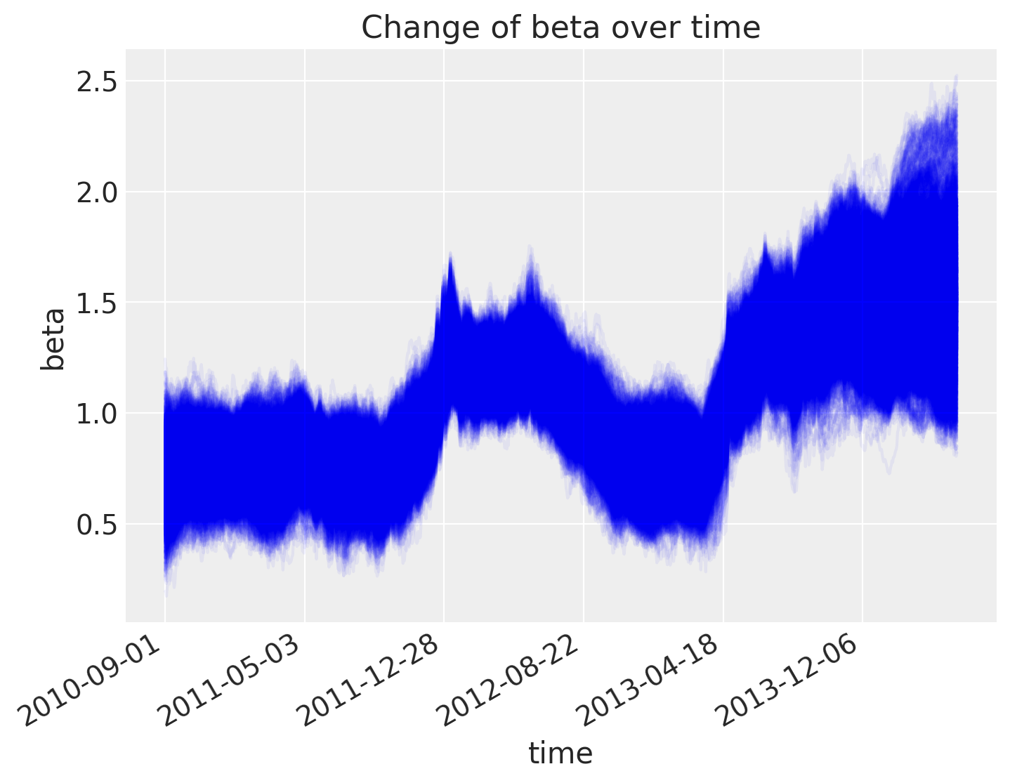
As does the slope.
fig = plt.figure(figsize=(8, 6), constrained_layout=False)
ax = fig.add_subplot(111, xlabel="time", ylabel="beta", title="Change of beta over time")
ax.plot(trace_rw.posterior.stack(pooled_chain=("chain", "draw"))["beta"], "b", alpha=0.05)

ax.xaxis.set_major_locator(ticks_changes)
ax.set_xticklabels(ticklabels_changes)

fig.autofmt_xdate()
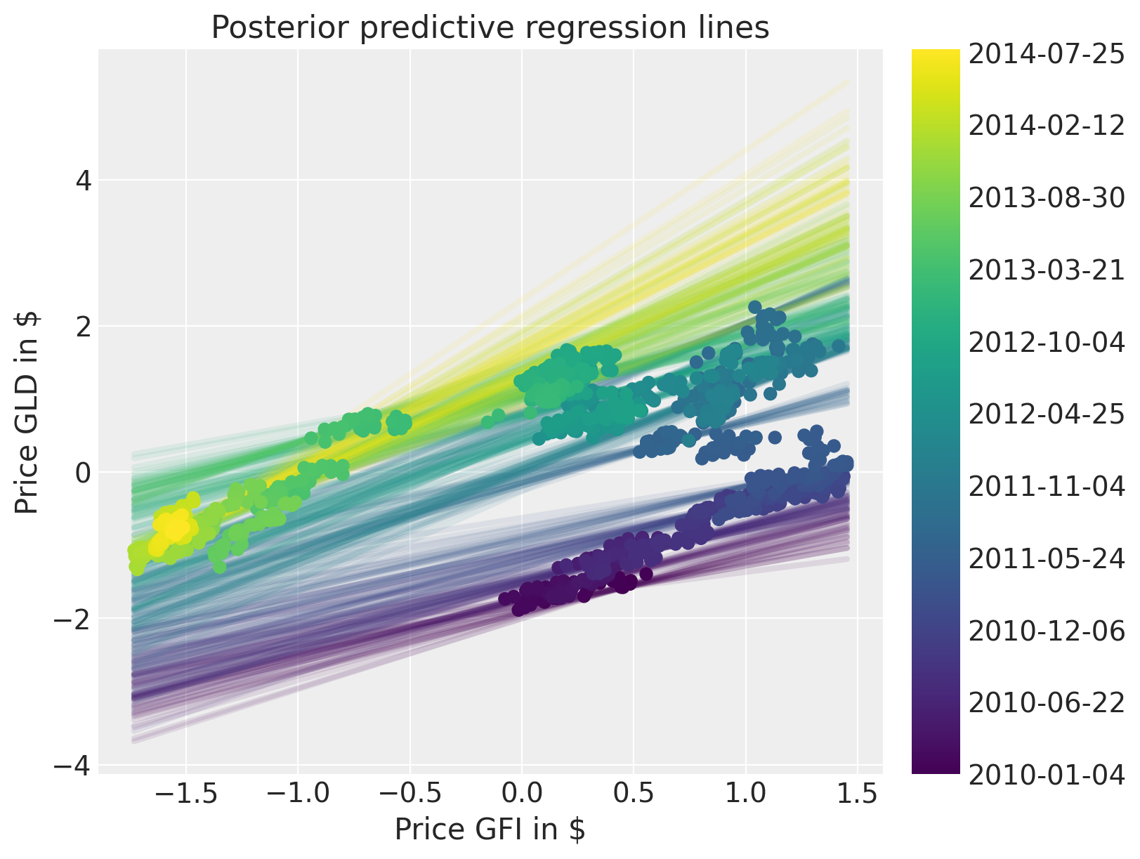
The posterior predictive plot shows that we capture the change in regression over time much better. Note that we should have used returns instead of prices. The model would still work the same, but the visualisations would not be quite as clear.
fig = plt.figure(figsize=(8, 6))
ax = fig.add_subplot(
    111,
    xlabel=r"Price GFI in \$",
    ylabel=r"Price GLD in \$",
    title="Posterior predictive regression lines",
)

colors = np.linspace(0, 1, len(prices))
colors_sc = np.linspace(0, 1, len(prices.index.values[::50]))

xi = xr.DataArray(np.linspace(prices_zscored.GFI.min(), prices_zscored.GFI.max(), 50))

for i, time in enumerate(prices.index.values[::50]):
    sel_trace = trace_rw.posterior.sel(time=time)
    regression_line = (
        (sel_trace["alpha"] + sel_trace["beta"] * xi)
        .stack(pooled_chain=("chain", "draw"))
        .isel(pooled_chain=slice(None, None, 200))
    )
    ax.plot(xi, regression_line, color=mymap(colors_sc[i]), alpha=0.1, zorder=10, linewidth=3)

sc = ax.scatter(
    prices_zscored.GFI, prices_zscored.GLD, label="data", cmap=mymap, c=colors, zorder=11
)

cb = plt.colorbar(sc, ticks=ticks)
cb.ax.set_yticklabels(ticklabels);
Author: Thomas Wiecki
Watermark
%load_ext watermark
%watermark -n -u -v -iv -w -p theano
Last updated: Thu Sep 09 2021

Python implementation: CPython
Python version       : 3.8.10
IPython version      : 7.25.0

theano: 1.1.2

pandas    : 1.2.1
xarray    : 0.17.0
bambi     : 0.6.0
matplotlib: 3.3.4
pymc3     : 3.11.2
arviz     : 0.11.2
numpy     : 1.21.0

Watermark: 2.2.0
- PyMC Contributors . "Rolling Regression". In: PyMC Examples. Ed. by PyMC Team. DOI: 10.5281/zenodo.5832070