


Simpson’s paradox and mixed models#
This notebook covers:
Simpson’s Paradox and its resolution through mixed or hierarchical models. This is a situation where there might be a negative relationship between two variables within a group, but when data from multiple groups are combined, that relationship may disappear or even reverse sign. The gif below (from the Simpson’s Paradox Wikipedia page) demonstrates this very nicely.
How to build linear regression models, starting with linear regression, moving up to hierarchical linear regression. Simpon’s paradox is a nice motivation for why we might want to do this - but of course we should aim to build models which incorporate as much as our knowledge about the structure of the data (e.g. it’s nested nature) as possible.
Use of
pm.Datacontainers to facilitate posterior prediction at different \(x\) values with the same model.Providing array dimensions (see
coords) to models to help with shape problems. This involves the use of xarray and is quite helpful in multi-level / hierarchical models.Differences between posteriors and posterior predictive distributions.
How to visualise models in data space and parameter space, using a mixture of ArviZ and matplotlib.

import arviz as az
import matplotlib.pyplot as plt
import numpy as np
import pandas as pd
import pymc as pm
import xarray as xr
%config InlineBackend.figure_format = 'retina'
az.style.use("arviz-darkgrid")
rng = np.random.default_rng(1234)
Generate data#
This data generation was influenced by this stackexchange question.
Show code cell source
def generate():
    group_list = ["one", "two", "three", "four", "five"]
    trials_per_group = 20
    group_intercepts = rng.normal(0, 1, len(group_list))
    group_slopes = np.ones(len(group_list)) * -0.5
    group_mx = group_intercepts * 2
    group = np.repeat(group_list, trials_per_group)
    subject = np.concatenate(
        [np.ones(trials_per_group) * i for i in np.arange(len(group_list))]
    ).astype(int)
    intercept = np.repeat(group_intercepts, trials_per_group)
    slope = np.repeat(group_slopes, trials_per_group)
    mx = np.repeat(group_mx, trials_per_group)
    x = rng.normal(mx, 1)
    y = rng.normal(intercept + (x - mx) * slope, 1)
    data = pd.DataFrame({"group": group, "group_idx": subject, "x": x, "y": y})
    return data, group_list
data, group_list = generate()
To follow along, it is useful to clearly understand the form of the data. This is long form data (also known as narrow data) in that each row represents one observation. We have a group column which has the group label, and an accompanying numerical group_idx column. This is very useful when it comes to modelling as we can use it as an index to look up group-level parameter estimates. Finally, we have our core observations of the predictor variable x and the outcome y.
display(data)
| group | group_idx | x | y | |
|---|---|---|---|---|
| 0 | one | 0 | -0.294574 | -2.338519 |
| 1 | one | 0 | -4.686497 | -1.448057 |
| 2 | one | 0 | -2.262201 | -1.393728 |
| 3 | one | 0 | -4.873809 | -0.265403 |
| 4 | one | 0 | -2.863929 | -0.774251 |
| ... | ... | ... | ... | ... |
| 95 | five | 4 | 3.981413 | 0.467970 |
| 96 | five | 4 | 1.889102 | 0.553290 |
| 97 | five | 4 | 2.561267 | 2.590966 |
| 98 | five | 4 | 0.147378 | 2.050944 |
| 99 | five | 4 | 2.738073 | 0.517918 |
100 rows × 4 columns
And we can visualise this as below.
Show code cell source
for i, group in enumerate(group_list):
    plt.scatter(
        data.query(f"group_idx=={i}").x,
        data.query(f"group_idx=={i}").y,
        color=f"C{i}",
        label=f"{group}",
    )
plt.legend(title="group");
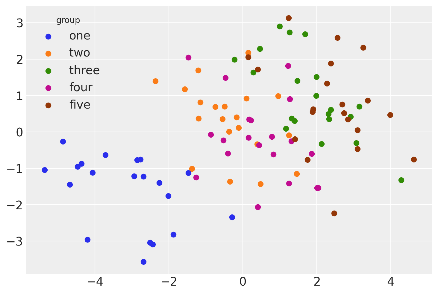
The rest of the notebook will cover different ways that we can analyse this data using linear models.
Model 1: Basic linear regression#
First we examine the simplest model - plain linear regression which pools all the data and has no knowledge of the group/multi-level structure of the data.
Build model#
with pm.Model() as linear_regression:
    sigma = pm.HalfCauchy("sigma", beta=2)
    β0 = pm.Normal("β0", 0, sigma=5)
    β1 = pm.Normal("β1", 0, sigma=5)
    x = pm.MutableData("x", data.x, dims="obs_id")
    μ = pm.Deterministic("μ", β0 + β1 * x, dims="obs_id")
    pm.Normal("y", mu=μ, sigma=sigma, observed=data.y, dims="obs_id")
pm.model_to_graphviz(linear_regression)

Do inference#
with linear_regression:
    idata = pm.sample()
Sampling 4 chains for 1_000 tune and 1_000 draw iterations (4_000 + 4_000 draws total) took 1 seconds.
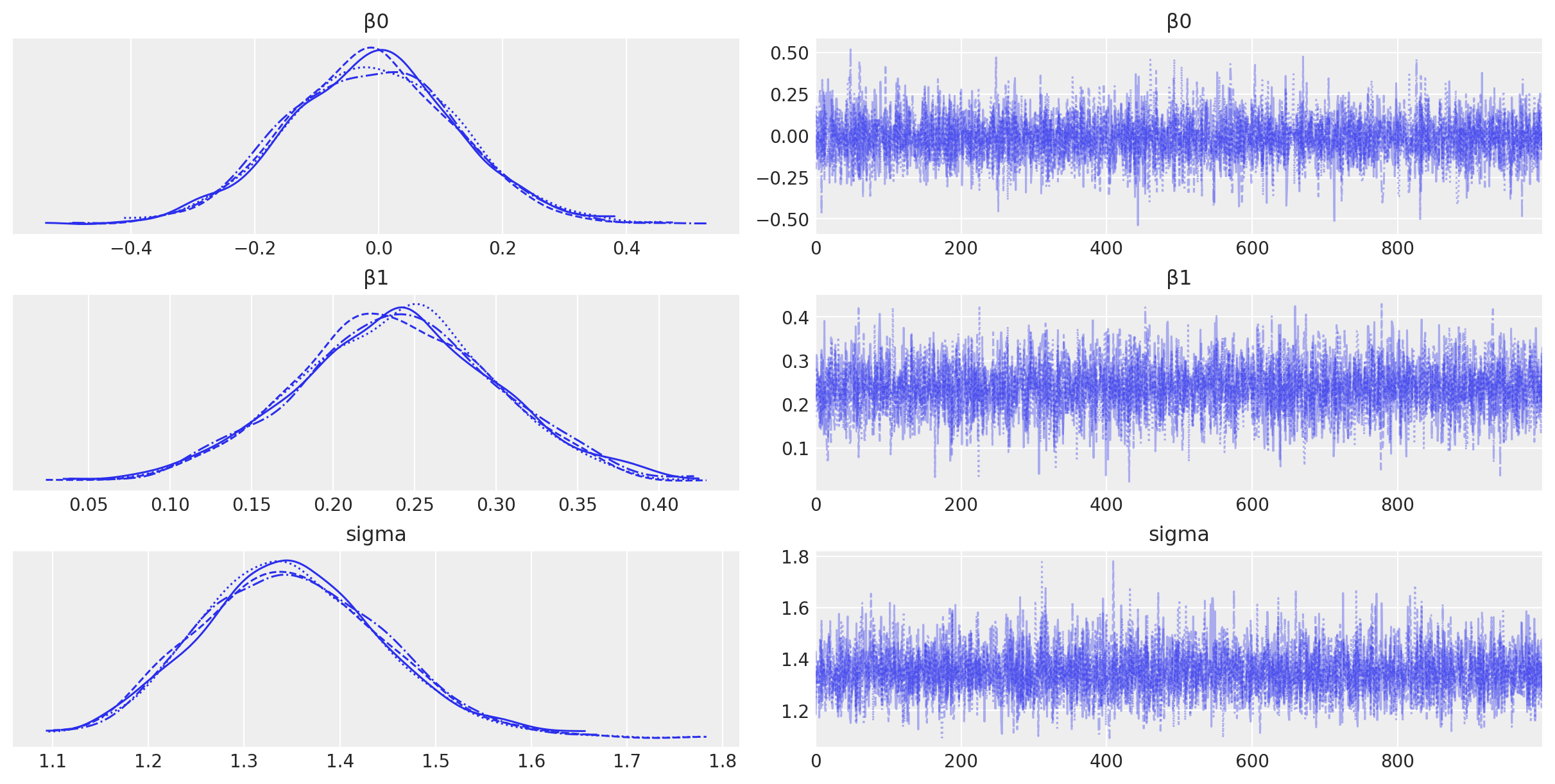
az.plot_trace(idata, filter_vars="regex", var_names=["~μ"]);
Visualisation#
# posterior prediction for these x values
xi = np.linspace(data.x.min(), data.x.max(), 20)

# do posterior predictive inference
with linear_regression:
    pm.set_data({"x": xi})
    idata.extend(pm.sample_posterior_predictive(idata, var_names=["y", "μ"]))
Show code cell source
fig, ax = plt.subplots(1, 3, figsize=(12, 4))

# conditional mean plot ---------------------------------------------
# data
ax[0].scatter(data.x, data.y, color="k")
# conditional mean credible intervals
post = az.extract(idata)
xi = xr.DataArray(np.linspace(np.min(data.x), np.max(data.x), 20), dims=["x_plot"])
y = post.β0 + post.β1 * xi
region = y.quantile([0.025, 0.15, 0.5, 0.85, 0.975], dim="sample")
ax[0].fill_between(
    xi, region.sel(quantile=0.025), region.sel(quantile=0.975), alpha=0.2, color="k", edgecolor="w"
)
ax[0].fill_between(
    xi, region.sel(quantile=0.15), region.sel(quantile=0.85), alpha=0.2, color="k", edgecolor="w"
)
# conditional mean
ax[0].plot(xi, region.sel(quantile=0.5), "k", linewidth=2)
# formatting
ax[0].set(xlabel="x", ylabel="y", title="Conditional mean")

# posterior prediction ----------------------------------------------
# data
ax[1].scatter(data.x, data.y, color="k")
# posterior mean and HDI's

ax[1].plot(xi, idata.posterior_predictive.y.mean(["chain", "draw"]), "k")

az.plot_hdi(
    xi,
    idata.posterior_predictive.y,
    hdi_prob=0.6,
    color="k",
    fill_kwargs={"alpha": 0.2, "linewidth": 0},
    ax=ax[1],
)
az.plot_hdi(
    xi,
    idata.posterior_predictive.y,
    hdi_prob=0.95,
    color="k",
    fill_kwargs={"alpha": 0.2, "linewidth": 0},
    ax=ax[1],
)
# formatting
ax[1].set(xlabel="x", ylabel="y", title="Posterior predictive distribution")

# parameter space ---------------------------------------------------
ax[2].scatter(
    az.extract(idata, var_names=["β1"]),
    az.extract(idata, var_names=["β0"]),
    color="k",
    alpha=0.01,
    rasterized=True,
)

# formatting
ax[2].set(xlabel="slope", ylabel="intercept", title="Parameter space")
ax[2].axhline(y=0, c="k")
ax[2].axvline(x=0, c="k");
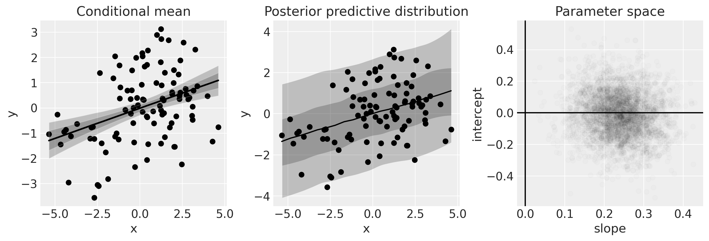
The plot on the left shows the data and the posterior of the conditional mean. For a given \(x\), we get a posterior distribution of the model (i.e. of \(\mu\)).
The plot in the middle shows the posterior predictive distribution, which gives a statement about the data we expect to see. Intuitively, this can be understood as not only incorporating what we know of the model (left plot) but also what we know about the distribution of error.
The plot on the right shows out posterior beliefs in parameter space.
One of the clear things about this analysis is that we have credible evidence that \(x\) and \(y\) are positively correlated. We can see this from the posterior over the slope (see right hand panel in the figure above).
Model 2: Independent slopes and intercepts model#
We will use the same data in this analysis, but this time we will use our knowledge that data come from groups. More specifically we will essentially fit independent regressions to data within each group.
coords = {"group": group_list}

with pm.Model(coords=coords) as ind_slope_intercept:
    # Define priors
    sigma = pm.HalfCauchy("sigma", beta=2, dims="group")
    β0 = pm.Normal("β0", 0, sigma=5, dims="group")
    β1 = pm.Normal("β1", 0, sigma=5, dims="group")
    # Data
    x = pm.MutableData("x", data.x, dims="obs_id")
    g = pm.MutableData("g", data.group_idx, dims="obs_id")
    # Linear model
    μ = pm.Deterministic("μ", β0[g] + β1[g] * x, dims="obs_id")
    # Define likelihood
    pm.Normal("y", mu=μ, sigma=sigma[g], observed=data.y, dims="obs_id")
By plotting the DAG for this model it is clear to see that we now have individual intercept, slope, and variance parameters for each of the groups.
pm.model_to_graphviz(ind_slope_intercept)

with ind_slope_intercept:
idata = pm.sample()
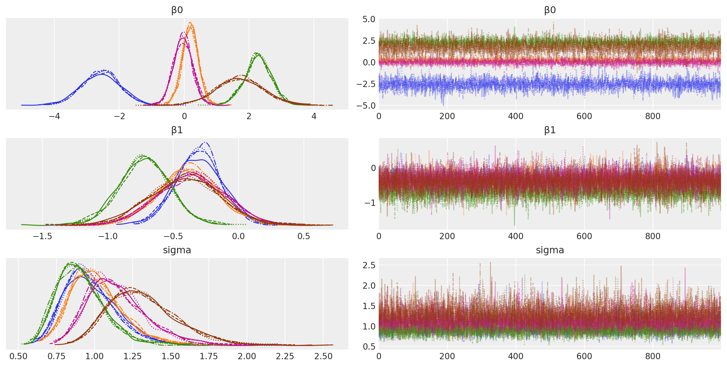
az.plot_trace(idata, filter_vars="regex", var_names=["~μ"]);
Sampling 4 chains for 1_000 tune and 1_000 draw iterations (4_000 + 4_000 draws total) took 3 seconds.
Visualisation#
# Create values of x and g to use for posterior prediction
xi = [
    np.linspace(data.query(f"group_idx=={i}").x.min(), data.query(f"group_idx=={i}").x.max(), 10)
    for i, _ in enumerate(group_list)
]
g = [np.ones(10) * i for i, _ in enumerate(group_list)]
xi, g = np.concatenate(xi), np.concatenate(g)

# Do the posterior prediction
with ind_slope_intercept:
    pm.set_data({"x": xi, "g": g.astype(int)})
    idata.extend(pm.sample_posterior_predictive(idata, var_names=["μ", "y"]))
Show code cell source
def get_ppy_for_group(group_list, group):
    """Get posterior predictive outcomes for observations from a given group"""
    return idata.posterior_predictive.y.data[:, :, group_list == group]


fig, ax = plt.subplots(1, 3, figsize=(12, 4))

# conditional mean plot ---------------------------------------------
for i, groupname in enumerate(group_list):
    # data
    ax[0].scatter(data.x[data.group_idx == i], data.y[data.group_idx == i], color=f"C{i}")
    # conditional mean credible intervals
    post = az.extract(idata)
    _xi = xr.DataArray(
        np.linspace(np.min(data.x[data.group_idx == i]), np.max(data.x[data.group_idx == i]), 20),
        dims=["x_plot"],
    )
    y = post.β0.sel(group=groupname) + post.β1.sel(group=groupname) * _xi
    region = y.quantile([0.025, 0.15, 0.5, 0.85, 0.975], dim="sample")
    ax[0].fill_between(
        _xi,
        region.sel(quantile=0.025),
        region.sel(quantile=0.975),
        alpha=0.2,
        color=f"C{i}",
        edgecolor="w",
    )
    ax[0].fill_between(
        _xi,
        region.sel(quantile=0.15),
        region.sel(quantile=0.85),
        alpha=0.2,
        color=f"C{i}",
        edgecolor="w",
    )
    # conditional mean
    ax[0].plot(_xi, region.sel(quantile=0.5), color=f"C{i}", linewidth=2)
    # formatting
    ax[0].set(xlabel="x", ylabel="y", title="Conditional mean")

# posterior prediction ----------------------------------------------
for i, groupname in enumerate(group_list):
    # data
    ax[1].scatter(data.x[data.group_idx == i], data.y[data.group_idx == i], color=f"C{i}")
    # posterior mean and HDI's
    ax[1].plot(xi[g == i], np.mean(get_ppy_for_group(g, i), axis=(0, 1)), label=groupname)
    az.plot_hdi(
        xi[g == i],
        get_ppy_for_group(g, i),  # pp_y[:, :, g == i],
        hdi_prob=0.6,
        color=f"C{i}",
        fill_kwargs={"alpha": 0.4, "linewidth": 0},
        ax=ax[1],
    )
    az.plot_hdi(
        xi[g == i],
        get_ppy_for_group(g, i),
        hdi_prob=0.95,
        color=f"C{i}",
        fill_kwargs={"alpha": 0.2, "linewidth": 0},
        ax=ax[1],
    )

ax[1].set(xlabel="x", ylabel="y", title="Posterior predictive distribution")


# parameter space ---------------------------------------------------
for i, _ in enumerate(group_list):
    ax[2].scatter(
        az.extract(idata, var_names="β1")[i, :],
        az.extract(idata, var_names="β0")[i, :],
        color=f"C{i}",
        alpha=0.01,
        rasterized=True,
    )

ax[2].set(xlabel="slope", ylabel="intercept", title="Parameter space")
ax[2].axhline(y=0, c="k")
ax[2].axvline(x=0, c="k");
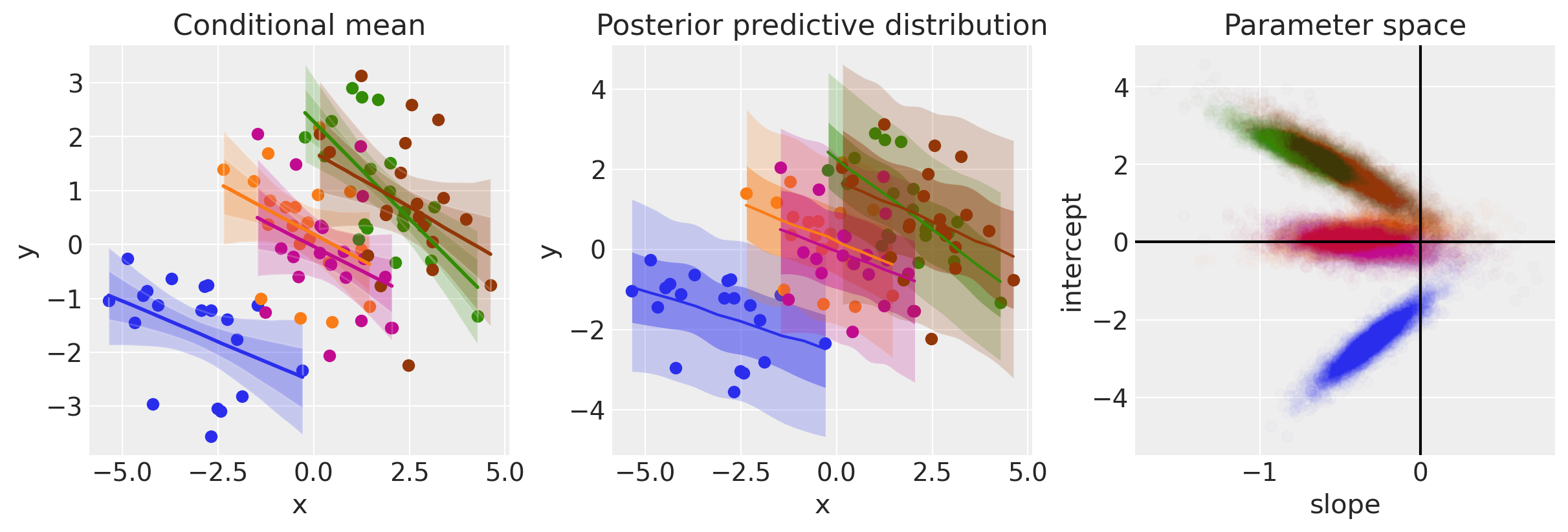
In contrast to plain regression model (Model 1), when we model on the group level we can see that now the evidence points toward negative relationships between \(x\) and \(y\).
Model 3: Hierarchical regression#
We can go beyond Model 2 and incorporate even more knowledge about the structure of our data. Rather than treating each group as entirely independent, we can use our knowledge that these groups are drawn from a population-level distribution. These are sometimes called hyper-parameters.
In one sense this move from Model 2 to Model 3 can be seen as adding parameters, and therefore increasing model complexity. However, in another sense, adding this knowledge about the nested structure of the data actually provides a constraint over parameter space.
Note: This model was producing divergent samples, so a reparameterisation trick is used. See the blog post Why hierarchical models are awesome, tricky, and Bayesian by Thomas Wiecki for more information on this.
non_centered = True

with pm.Model(coords=coords) as hierarchical:
    # Hyperpriors
    intercept_mu = pm.Normal("intercept_mu", 0, sigma=1)
    intercept_sigma = pm.HalfNormal("intercept_sigma", sigma=2)
    slope_mu = pm.Normal("slope_mu", 0, sigma=1)
    slope_sigma = pm.HalfNormal("slope_sigma", sigma=2)
    sigma_hyperprior = pm.HalfNormal("sigma_hyperprior", sigma=0.5)

    # Define priors
    sigma = pm.HalfNormal("sigma", sigma=sigma_hyperprior, dims="group")

    if non_centered:
        β0_offset = pm.Normal("β0_offset", 0, sigma=1, dims="group")
        β0 = pm.Deterministic("β0", intercept_mu + β0_offset * intercept_sigma, dims="group")
        β1_offset = pm.Normal("β1_offset", 0, sigma=1, dims="group")
        β1 = pm.Deterministic("β1", slope_mu + β1_offset * slope_sigma, dims="group")
    else:
        β0 = pm.Normal("β0", intercept_mu, sigma=intercept_sigma, dims="group")
        β1 = pm.Normal("β1", slope_mu, sigma=slope_sigma, dims="group")

    # Data
    x = pm.MutableData("x", data.x, dims="obs_id")
    g = pm.MutableData("g", data.group_idx, dims="obs_id")
    # Linear model
    μ = pm.Deterministic("μ", β0[g] + β1[g] * x, dims="obs_id")
    # Define likelihood
    pm.Normal("y", mu=μ, sigma=sigma[g], observed=data.y, dims="obs_id")
Plotting the DAG now makes it clear that the group-level intercept and slope parameters are drawn from a population level distributions. That is, we have hyper-priors for the slopes and intercept parameters. This particular model does not have a hyper-prior for the measurement error - this is just left as one parameter per group, as in the previous model.
pm.model_to_graphviz(hierarchical)

with hierarchical:
idata = pm.sample(tune=2000, target_accept=0.99)
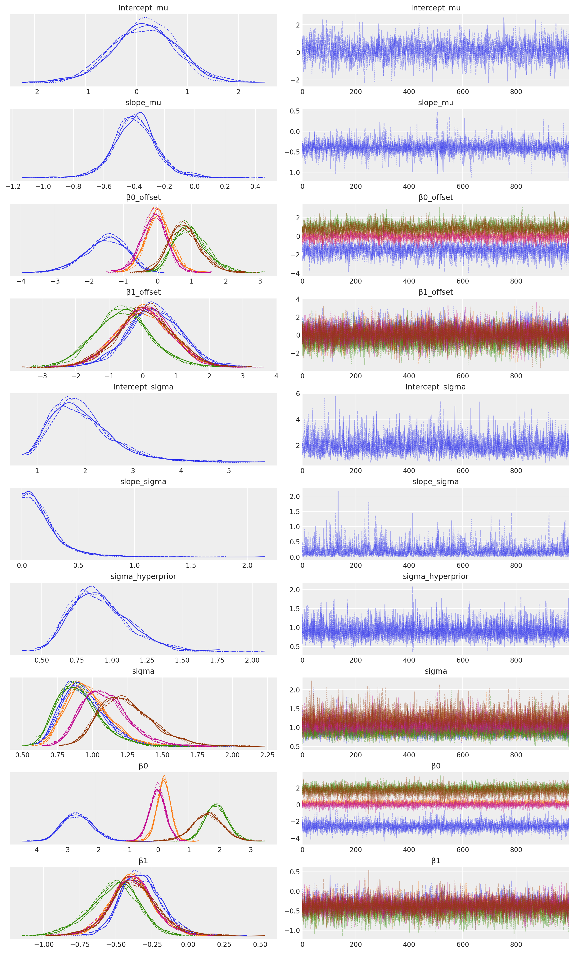
az.plot_trace(idata, filter_vars="regex", var_names=["~μ"]);
Sampling 4 chains for 2_000 tune and 1_000 draw iterations (8_000 + 4_000 draws total) took 36 seconds.
Visualise#
# Create values of x and g to use for posterior prediction
xi = [
    np.linspace(data.query(f"group_idx=={i}").x.min(), data.query(f"group_idx=={i}").x.max(), 10)
    for i, _ in enumerate(group_list)
]
g = [np.ones(10) * i for i, _ in enumerate(group_list)]
xi, g = np.concatenate(xi), np.concatenate(g)

# Do the posterior prediction
with hierarchical:
    pm.set_data({"x": xi, "g": g.astype(int)})
    idata.extend(pm.sample_posterior_predictive(idata, var_names=["μ", "y"]))
Show code cell source
fig, ax = plt.subplots(1, 3, figsize=(12, 4))

# conditional mean plot ---------------------------------------------
for i, groupname in enumerate(group_list):
    # data
    ax[0].scatter(data.x[data.group_idx == i], data.y[data.group_idx == i], color=f"C{i}")
    # conditional mean credible intervals
    post = az.extract(idata)
    _xi = xr.DataArray(
        np.linspace(np.min(data.x[data.group_idx == i]), np.max(data.x[data.group_idx == i]), 20),
        dims=["x_plot"],
    )
    y = post.β0.sel(group=groupname) + post.β1.sel(group=groupname) * _xi
    region = y.quantile([0.025, 0.15, 0.5, 0.85, 0.975], dim="sample")
    ax[0].fill_between(
        _xi,
        region.sel(quantile=0.025),
        region.sel(quantile=0.975),
        alpha=0.2,
        color=f"C{i}",
        edgecolor="w",
    )
    ax[0].fill_between(
        _xi,
        region.sel(quantile=0.15),
        region.sel(quantile=0.85),
        alpha=0.2,
        color=f"C{i}",
        edgecolor="w",
    )
    # conditional mean
    ax[0].plot(_xi, region.sel(quantile=0.5), color=f"C{i}", linewidth=2)
    # formatting
    ax[0].set(xlabel="x", ylabel="y", title="Conditional mean")

# posterior prediction ----------------------------------------------
for i, groupname in enumerate(group_list):
    # data
    ax[1].scatter(data.x[data.group_idx == i], data.y[data.group_idx == i], color=f"C{i}")
    # posterior mean and HDI's
    ax[1].plot(xi[g == i], np.mean(get_ppy_for_group(g, i), axis=(0, 1)), label=groupname)
    az.plot_hdi(
        xi[g == i],
        get_ppy_for_group(g, i),
        hdi_prob=0.6,
        color=f"C{i}",
        fill_kwargs={"alpha": 0.4, "linewidth": 0},
        ax=ax[1],
    )
    az.plot_hdi(
        xi[g == i],
        get_ppy_for_group(g, i),
        hdi_prob=0.95,
        color=f"C{i}",
        fill_kwargs={"alpha": 0.2, "linewidth": 0},
        ax=ax[1],
    )

ax[1].set(xlabel="x", ylabel="y", title="Posterior Predictive")

# parameter space ---------------------------------------------------
# plot posterior for population level slope and intercept
slope = rng.normal(
    az.extract(idata, var_names="slope_mu"),
    az.extract(idata, var_names="slope_sigma"),
)
intercept = rng.normal(
    az.extract(idata, var_names="intercept_mu"),
    az.extract(idata, var_names="intercept_sigma"),
)
ax[2].scatter(slope, intercept, color="k", alpha=0.05)
# plot posterior for group level slope and intercept
for i, _ in enumerate(group_list):
    ax[2].scatter(
        az.extract(idata, var_names="β1")[i, :],
        az.extract(idata, var_names="β0")[i, :],
        color=f"C{i}",
        alpha=0.01,
    )

ax[2].set(xlabel="slope", ylabel="intercept", title="Parameter space", xlim=[-2, 1], ylim=[-5, 5])
ax[2].axhline(y=0, c="k")
ax[2].axvline(x=0, c="k");
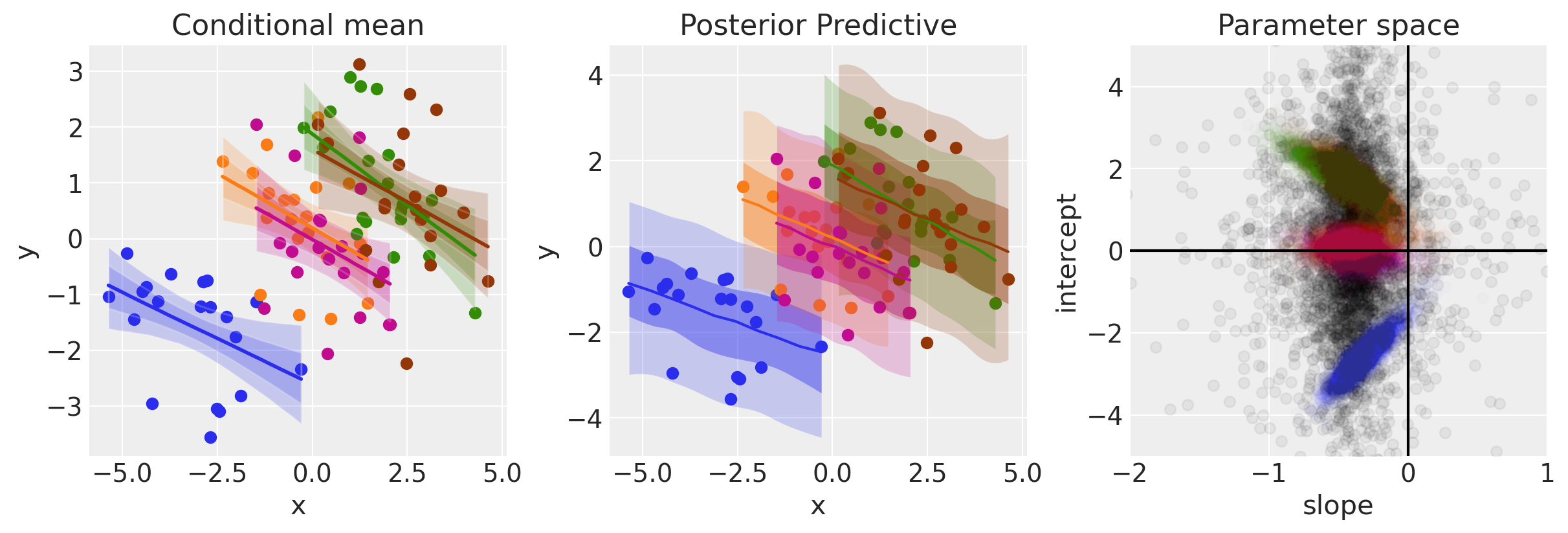
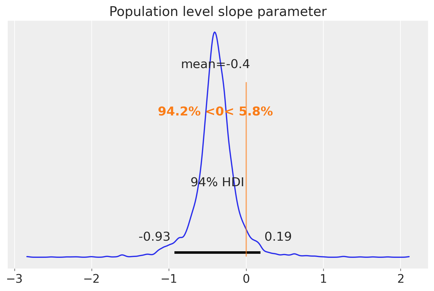
The panel on the right shows the posterior group level posterior of the slope and intercept parameters in black. This particular visualisation is a little unclear however, so we can just plot the marginal distribution below to see how much belief we have in the slope being less than zero.
Show code cell source
az.plot_posterior(slope, ref_val=0)
plt.title("Population level slope parameter");
Summary#
Using Simpson’s paradox, we’ve walked through 3 different models. The first is a simple linear regression which treats all the data as coming from one group. We saw that this lead us to believe the regression slope was positive.
While that is not necessarily wrong, it is paradoxical when we see that the regression slopes for the data within a group is negative. We saw how to apply separate regressions for data in each group in the second model.
The third and final model added a layer to the hierarchy, which captures our knowledge that each of these groups are sampled from an overall population. This added the ability to make inferences not only about the regression parameters at the group level, but also at the population level. The final plot shows our posterior over this population level slope parameter from which we believe the groups are sampled from.
If you are interested in learning more, there are a number of other PyMC examples covering hierarchical modelling and regression topics.
Watermark#
%load_ext watermark
%watermark -n -u -v -iv -w -p pytensor,aeppl
Last updated: Sun Feb 05 2023

Python implementation: CPython
Python version       : 3.10.9
IPython version      : 8.9.0

pytensor: 2.8.11
aeppl   : not installed

numpy     : 1.24.1
xarray    : 2023.1.0
pymc      : 5.0.1
arviz     : 0.14.0
matplotlib: 3.6.3
pandas    : 1.5.3

Watermark: 2.3.1
License notice#
All the notebooks in this example gallery are provided under the MIT License which allows modification, and redistribution for any use provided the copyright and license notices are preserved.
Citing PyMC examples#
To cite this notebook, use the DOI provided by Zenodo for the pymc-examples repository.
Important
Many notebooks are adapted from other sources: blogs, books… In such cases you should cite the original source as well.
Also remember to cite the relevant libraries used by your code.
Here is an citation template in bibtex:
@incollection{citekey,
  author    = "<notebook authors, see above>",
  title     = "<notebook title>",
  editor    = "PyMC Team",
  booktitle = "PyMC examples",
  doi       = "10.5281/zenodo.5654871"
}
which once rendered could look like: